

Magazine C Cart
매거진c는 “의자”를 통해 디자인과 라이프스타일의 새로운 시선을 선보이는 매거진입니다.
여러곳에서 다양한 사람들과 교류할 수 있는 이동식 매거진 카트를 선보입니다.
Magazine C offers a fresh perspective on design and lifestyle through the “chair.”
Our mobile magazine cart travels from place to place, bringing the magazine closer to people and creating new moments of connection and exchange.
Client: Magazine C
Project direction: Jeon eunkyoung, Yoo dami (magazine c)
Creative direction: Lee dalwoo (maum studio)
Design lead: Oh eunhye (maum studio)
Design Assist: Jeon haena, go sujeong (maum studio)
Support: Yun seoyeon (maum studio)
ⓒ 2026 MAUM STUDIO. All rights reserved.


Centre Pompidou Hanwha Museum Shop Product
퐁피두센터 한화 뮤지엄 숍의 상품을 디자인하고 만들었습니다.
뮤지엄 개관을 기념하는 조명, 건축적 아이덴티티와 한국의 문화적 요소를 연결하는 오브제, 뮤지엄의 아이덴티티를 기념할 수 있는 제품 등 다양한 카테고리의 상품을 제안하고 디자인하였습니다.
Designed and developed a collection of museum shop products for the Pompidou Center Hanwha Museum Shop.
The collection includes commemorative lighting created for the museum's opening, objects that connect the building's architectural identity with elements of Korean culture, and products that celebrate the museum's unique identity. Across a range of categories, each item was conceived to offer visitors a meaningful and memorable experience while extending the museum's identity beyond the exhibition space.
Client: CENTRE POMPIDOU HANWHA
Project Direction: Jung Youngjin, Kim Suji (POMPIDOU CENTRE HANWHA)
Creative Direction: Lee Dalwoo (MAUM STUDIO)
Design: Lee Yoonji, Kim Garam, Song Eunjeong, Lee Jieun (MAUM STUDIO)
Management: SUZUKI KUMIKO(MAUM STUDIO)
Cooperation: be formative, Lee Jun-hee, Lee Seongmi
Duration: 2026.01. - 2026. 6.
Photo: Lee Juyeon
ⓒ 2026 MAUM STUDIO. All rights reserved.
퐁피두 센터 한화 인주함
퐁피두센터 한화 건축의 상징적인 호(Ark) 형태를 상품 디자인의 모티프로 활용하고, 그 안에 한국의 기록 문화를 담아냈습니다.
한국에서는 이름을 쓰는 것만큼이나 도장을 찍는 행위가 중요한 문화입니다. 인장은 단순한 표식이 아니라 개인의 존재를 증명하고, 문서와 작품을 완성하는 상징으로 오랫동안 사용되어 왔습니다. 이러한 한국의 기록 문화를 현대적인 뮤지엄 기념품으로 재해석하여 인주를 디자인했습니다.
호(Ark)의 간결한 조형 안에 한국 전통 인주의 붉은색을 담아, 한국적인 상징성과 현대적인 건축 언어가 하나의 오브제로 자연스럽게 만날 수 있도록 디자인하였습니다.
The iconic Ark form of the Pompidou Center Hanwha building was used as the central motif for this product design, incorporating Korea's culture of documentation and authentication.
In Korea, stamping a seal is as significant as writing one's name. More than a simple mark, a seal has long served as a symbol of personal identity, authenticity, and the completion of official documents and works. Inspired by this tradition, the ink pad reinterprets Korea's recording culture as a contemporary museum souvenir.
The product combines the clean architectural silhouette of the Ark with the distinctive red of traditional Korean ink pads, creating an object where Korean cultural symbolism and contemporary architectural language come together in a simple yet meaningful form.


퐁피두 센터 한화 인센스함
퐁피두센터 한화 건축의 상징적인 호(Ark) 형태를 상품 디자인의 모티프로 활용하고, 그 안에 한국의 향 문화를 담아냈습니다. 한국에서는 오래전부터 향을 피우며 공간을 정갈하게 하고 마음을 가다듬는 문화를 이어왔습니다. 향은 단순히 향기를 위한 도구가 아니라 사유와 휴식, 의식을 위한 매개체로 사용되어 왔습니다.
이러한 한국의 향 문화를 현대적인 뮤지엄 오브제로 재해석하여 인센스 함을 디자인했습니다. 호(Ark)의 간결한 조형 안에 향을 담는 기능을 더해, 한국적인 정서와 현대적인 건축 언어가 하나의 오브제로 자연스럽게 만날 수 있도록 디자인하였습니다.
Cooperation: Lee Jun-hee, Lee Seongmi


Cooperation: Lee Jun-hee, Lee Seongmi


퐁피두 센터 한화 VIP Present
퐁피두센터 한화 건축의 상징적인 형태를 디자인의 모티프로 활용하여 조명을 제안하고 개관을 기념하는 VIP Present로 만들었습니다. 한국의 문화 등대가 되는 뮤지엄의 의미를 담았습니다.
조명 디자인, 제작은 be formative와 함께하였습니다.
Design Cooperation: be formative


Centre Pompidou Hanwha
Museum Shop Service Design
퐁피두센터 한화 뮤지엄 숍의 디자인 가이드, 상품, 서비스 디자인.
뮤지엄 숍의 아이덴티티 가이드를 구축하고,이를 기반으로 다양한 상품을 기획·디자인·제작하여브랜드 아이덴티티가 공간과 제품 전반에 일관되게 적용되는 경험을 만들었습니다.
Design Guideline, Merchandise, and Service Design for the Centre Pompidou Hanwha Museum Shop.Developed the museum shop’s identity guideline and, based on it, planned, designed, and produced a range of merchandise to create a cohesive brand experience across the space and its products.
Client: CENTRE POMPIDOU HANWHA
Project Direction: Jung Youngjin, Kim Suji (POMPIDOU CENTRE HANWHA)
Creative Direction: Lee Dalwoo (MAUM STUDIO)
Design: Kim Garam, Lee Yoonji, Song Eunjeong, Lee Jieun (MAUM STUDIO)
Management: SUZUKI KUMIKO(MAUM STUDIO)
Duration: 2026.01. - 2026. 6.
Photo: Lee Juyeon
ⓒ 2026 MAUM STUDIO. All rights reserved.


경기도미술관 세월호참사 10주기 추념전
《우리가, 바다》 도록
마음 스튜디오는 경기도미술관에서 열린 세월호참사 10주기 추념전 《우리가, 바다》의 전시 그래픽에 이어 도록을 디자인했습니다.
전시의 메인 그래픽은 따뜻하게 빛나는 바다의 ‘윤슬’에서 출발했습니다. 전시에 참여한 작가와 작품들이 서로 연결되어 하나의 바다를 이루고, 그 안에서 각자의 빛을 내는 모습이 윤슬과 닮아 있다고 생각했습니다.
도록에서도 이러한 개념을 이어, 종이가 겹쳐지는 레이어를 통해 수면 위로 겹겹이 번지는 윤슬의 빛을 표현했습니다. 여러 권의 책이 쌓였을 때에는 각각의 윤슬이 이어지고 겹쳐져 하나의 바다처럼 보이도록 디자인했습니다.
MAUM STUDIO designed the catalogue for We, the Sea, a commemorative exhibition marking the 10th anniversary of the Sewol Ferry Disaster at the Gyeonggi Museum of Modern Art.
The visual concept was inspired by yoonseul—the shimmering reflection of light on the sea. We saw the participating artists and their works as individual points of light, connected to form one continuous sea.
This idea extends into the catalogue through layers of paper that evoke the soft shimmer of light across the water. When multiple copies are stacked together, the reflections overlap and connect, forming a sea of light.
Client: Gyeonggi Museum of Modern Art 경기도미술관Role: Key visual and space design
Curator: Jo Minhwa (GMoMA)
Curatorial Assistant: Lee Sookhyung (GMoMA)
Art Direction & Design: Lee Yoonji (MAUM STUDIO)
Book Design: Lim Youngjin (MAUM STUDIO)
Photo: Lee Juyeon
ⓒ 2025 MAUM STUDIO. All rights reserved.


NAVER
《LOCAL GROUND》
지난해 진행한 네이버 ‘BE LOCAL WEEK’ 프로젝트의 맥락을 이어, 올해는 ‘LOCAL GROUND’ 프로젝트를 진행하였습니다.
네이버 ‘LOCAL GROUND’는 지역의 다양한 로컬 브랜드와 사람들을 하나의 플랫폼으로 연결하고, 도시만의 새로운 문화를 만들어가는 프로젝트입니다.
마음스튜디오는 부산 LOCAL GROUND의 비주얼 아이덴티티를 비롯해 키 비주얼, 홍보물, 공간 그래픽, 굿즈를 디자인하고 제작하였습니다.
부산의 다양한 로컬 이야기를 하나의 그래픽 언어로 연결하여, 사람들이 도시를 새롭게 경험하고 로컬과 더욱 가까워질 수 있는 브랜드 경험을 제안하였습니다.
Following last year’s NAVER ‘BE LOCAL WEEK’ project, we continued with ‘LOCAL GROUND’ this year.
NAVER ‘LOCAL GROUND’ is a project that connects diverse local brands and people through a shared platform, creating a unique culture for each city.
For LOCAL GROUND Busan, MAUM STUDIO designed and produced the visual identity, key visuals, promotional materials, spatial graphics, and merchandise.
By bringing Busan’s diverse local stories together through a cohesive graphic language, we created a brand experience that invites people to discover the city from a new perspective and connect more closely with its local culture.
Client: NAVER
Project Direction: Yeon Seoin, Kim Donggyu, Baek Hana (NAVER)
Creative Direction: Lee Dalwoo (MAUM STUDIO)
Identity, Visual, Product Design: Lee Yoonji, Kim Garam (MAUM STUDIO)
Space Design: Lee Dalwoo, Kim Dohyun(MAUM STUDIO, uioe)
Assist Design: Lee Jieun
motion Design: Kim Eunjin
Project Management: SUZUKI KUMIKO(MAUM STUDIO)
Photo: Lee Juyeon


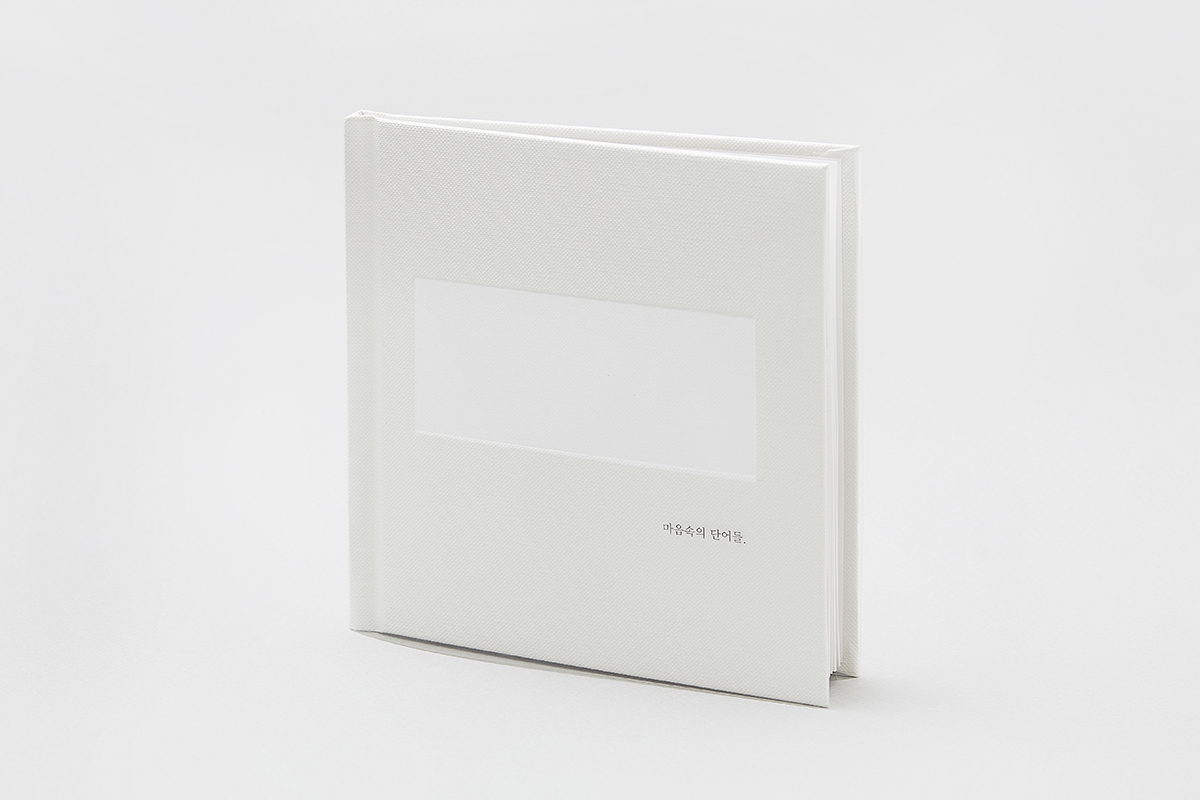
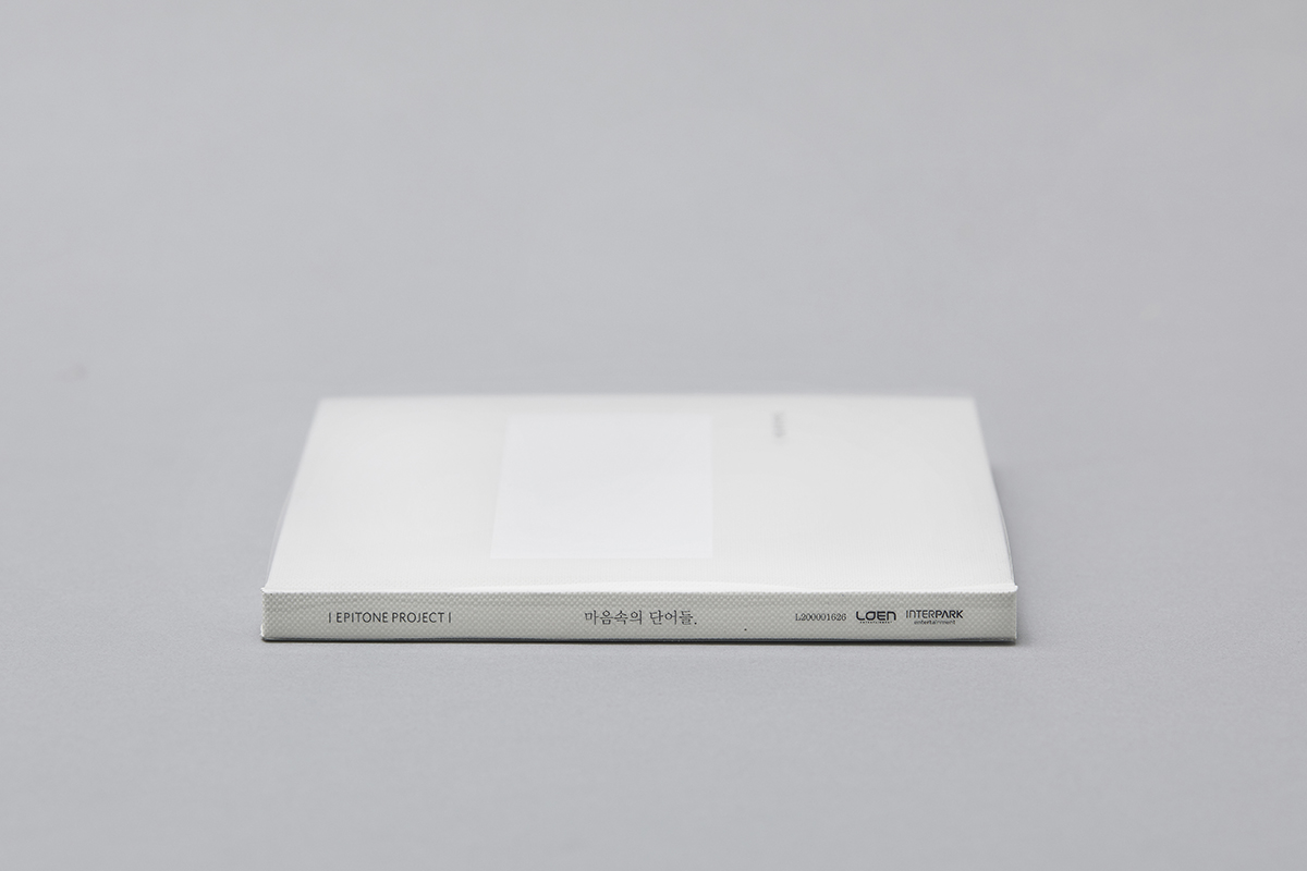
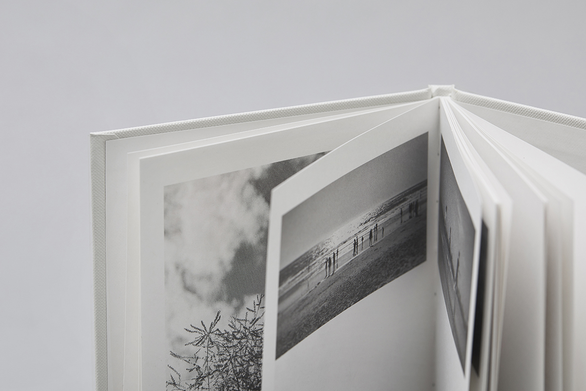
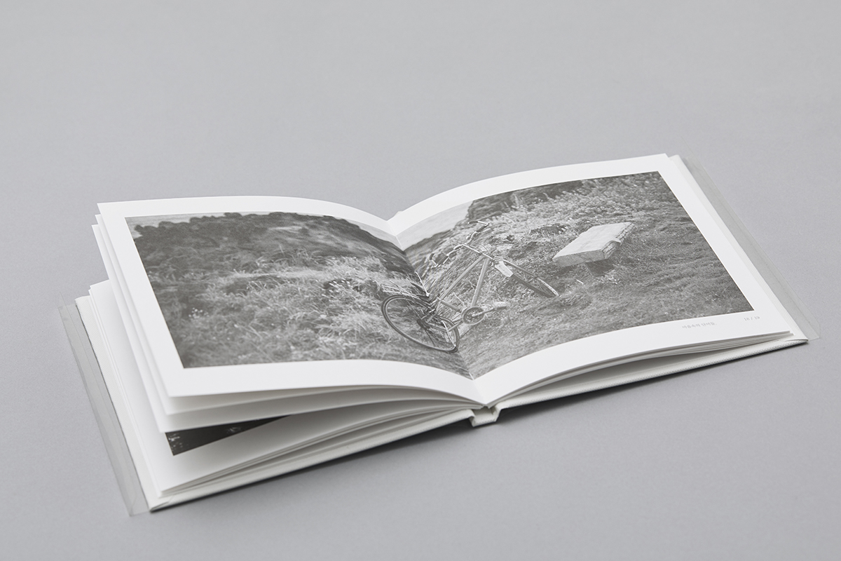

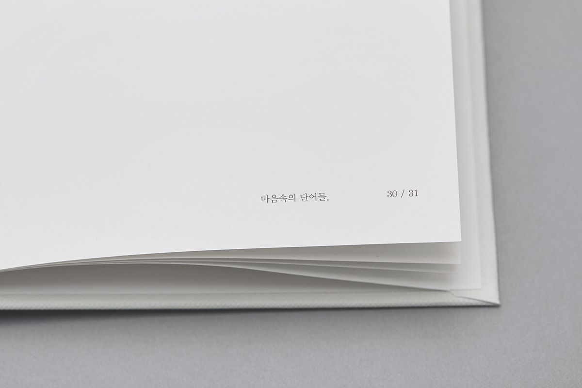
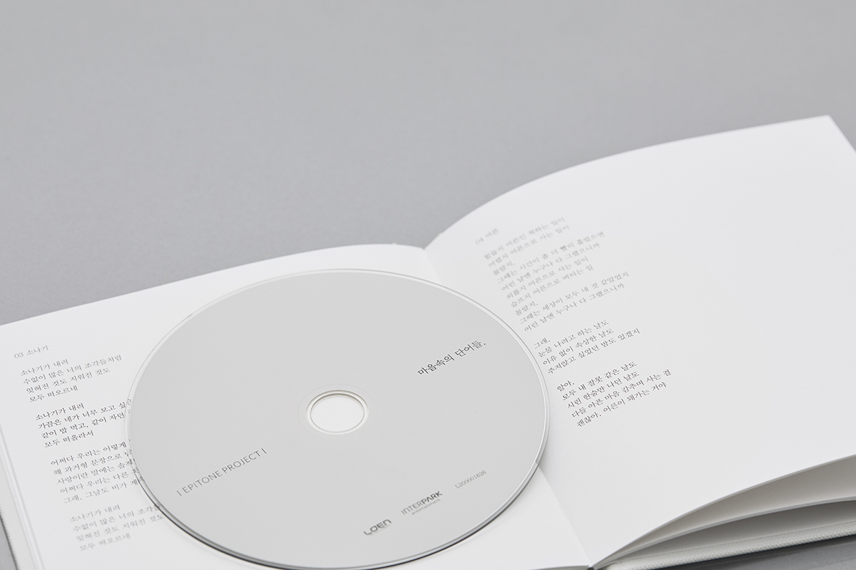
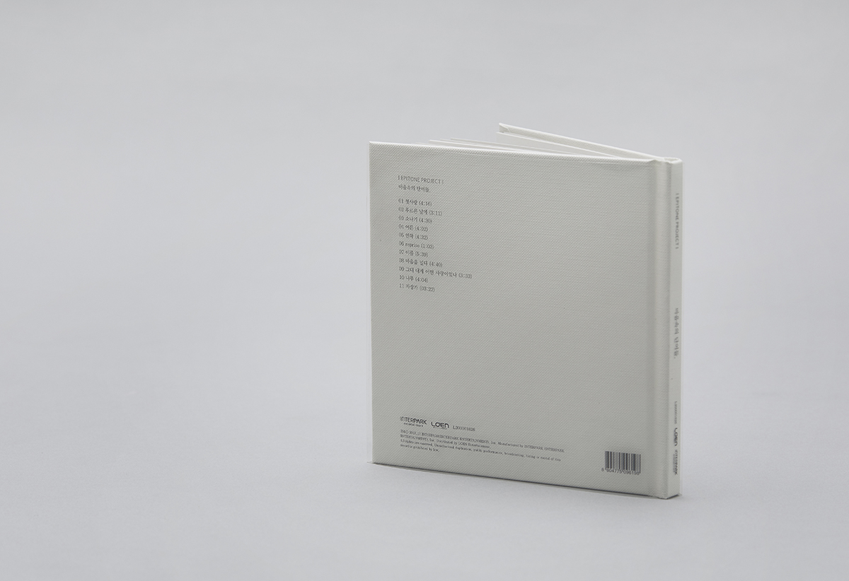
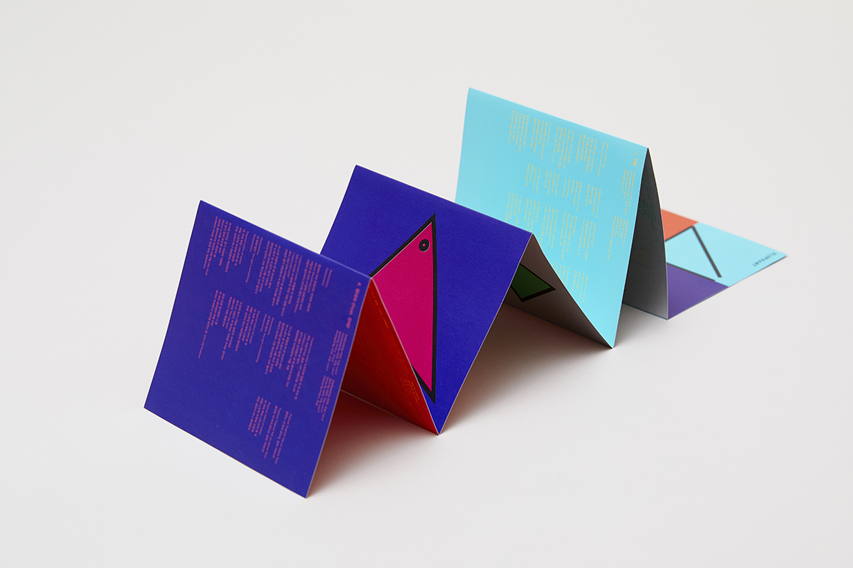
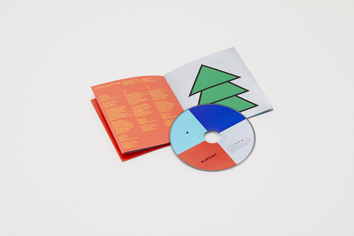
EPITONE PROJECT - 마음속의 단어들.
Client
- Interpark ENT
Design
- maumstudio
Photo
- Juyeon Lee
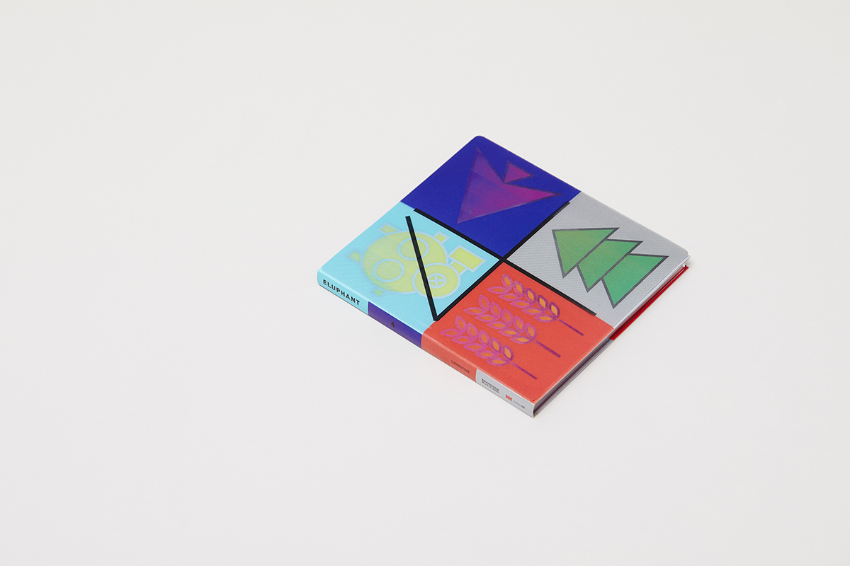

Monami 153
Note
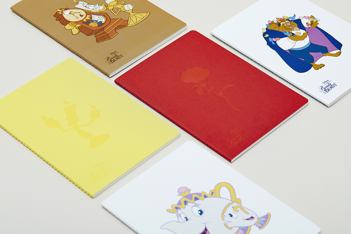
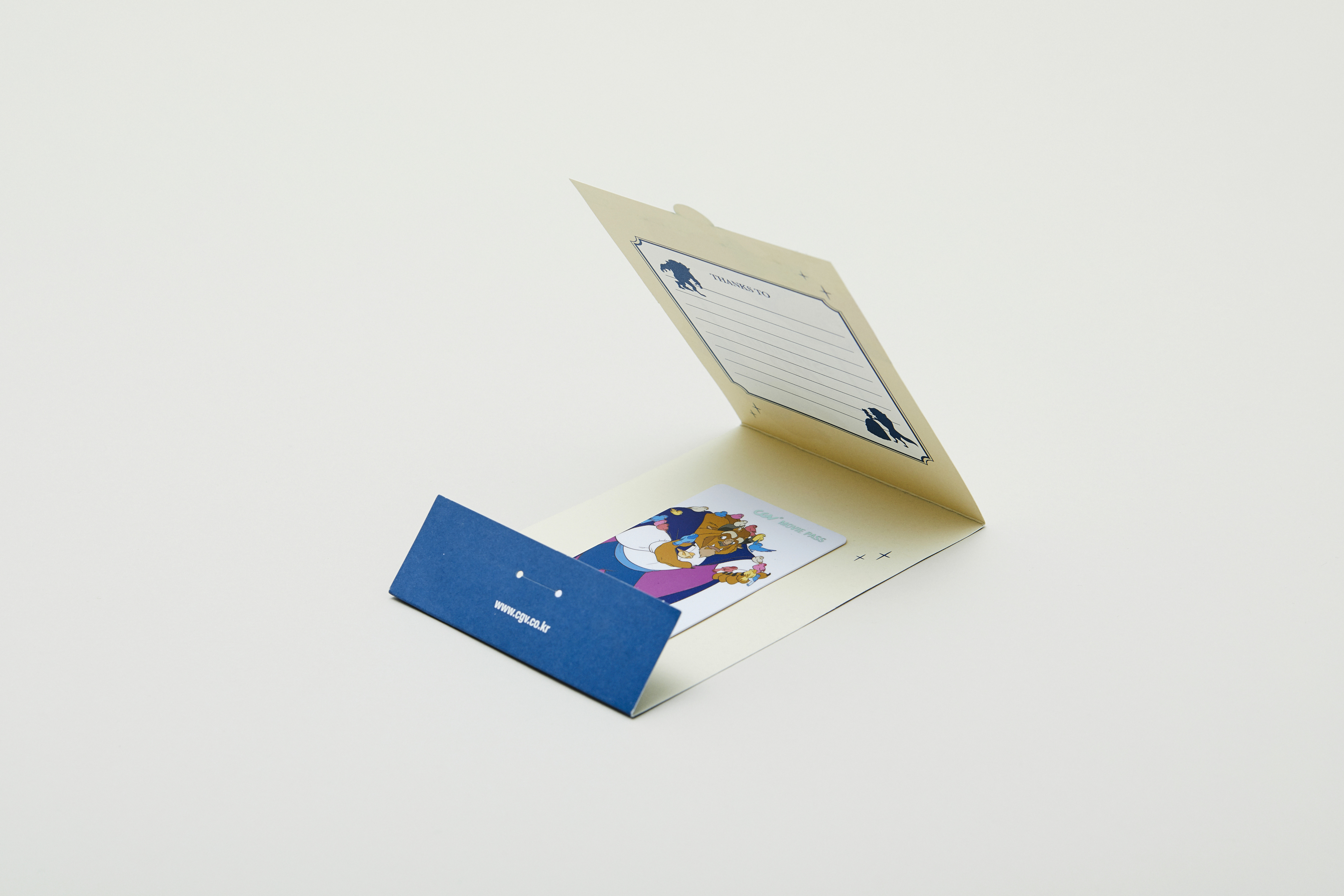
Passcard
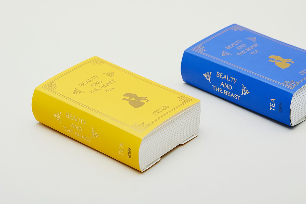
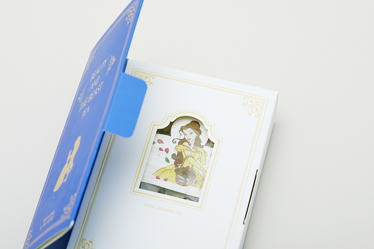
Tea Set
Soohyang Candle
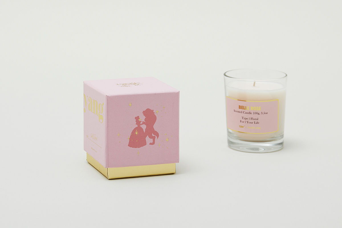
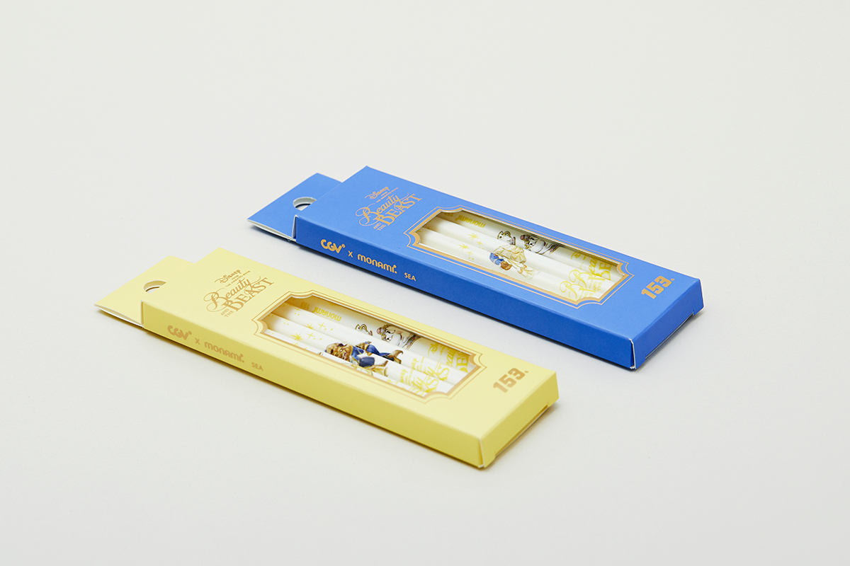
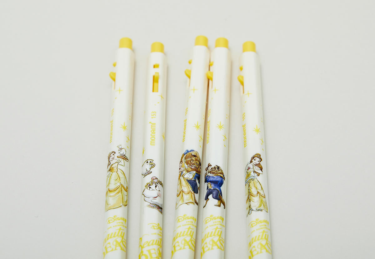
미녀와 야수 (Beauty and the Beast, 2017) Product
Client
- CGV
Design
- maumstudio
Photo
- Juyeon Lee
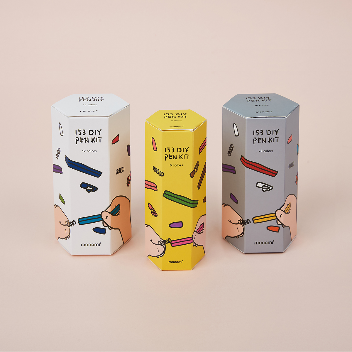
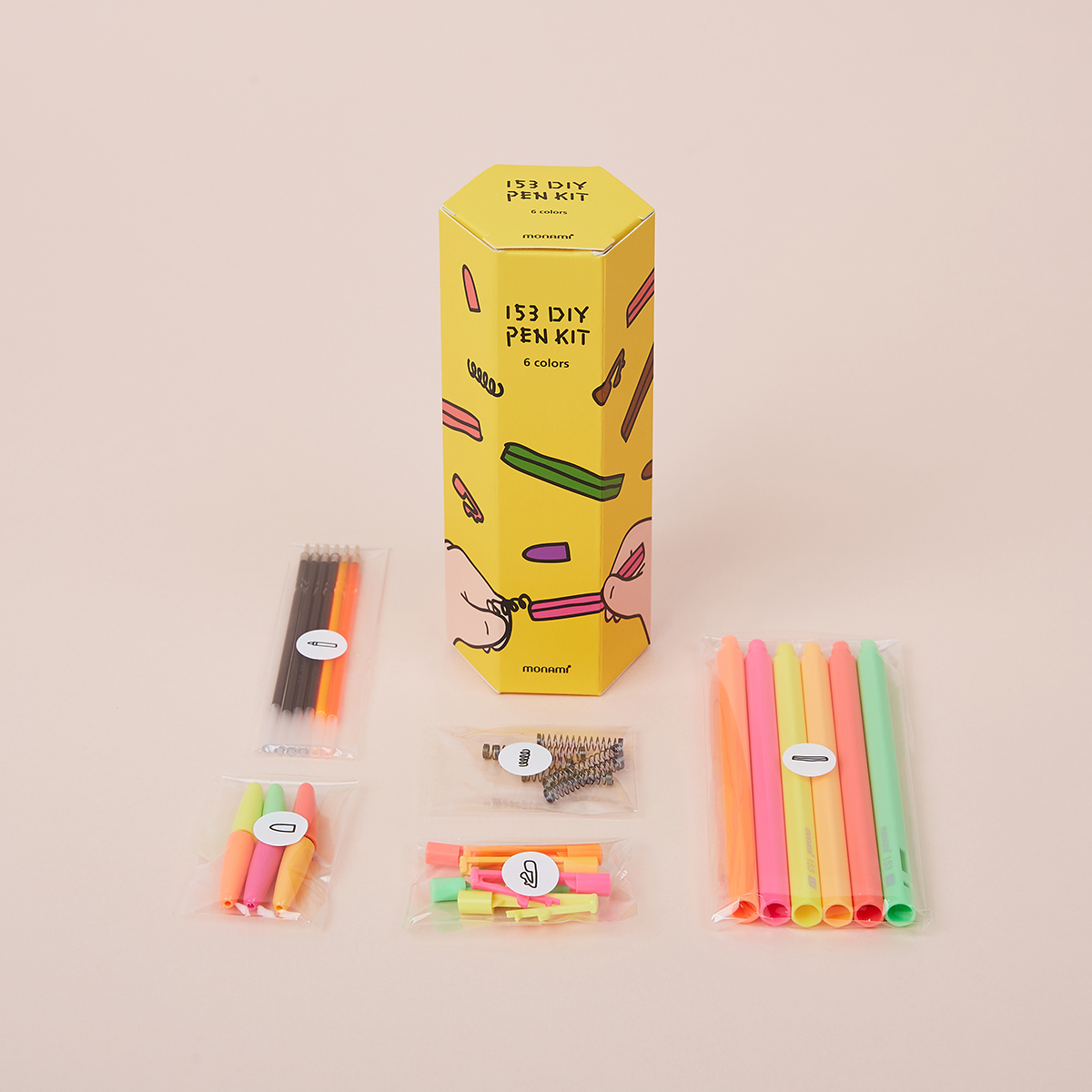
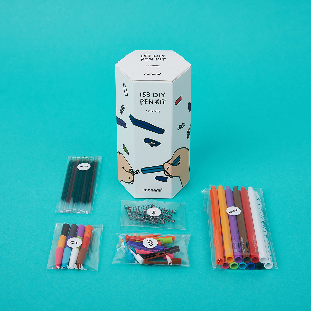
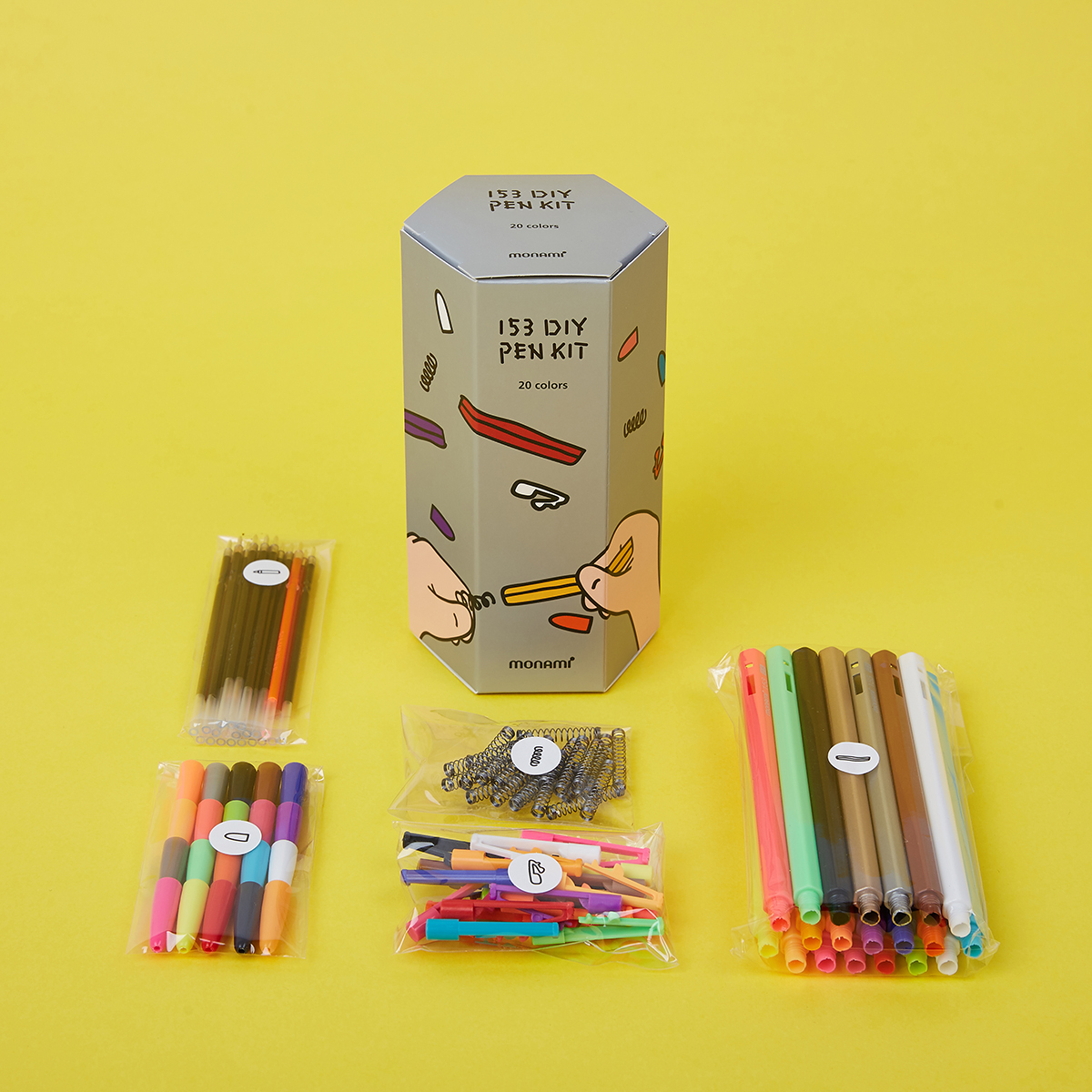
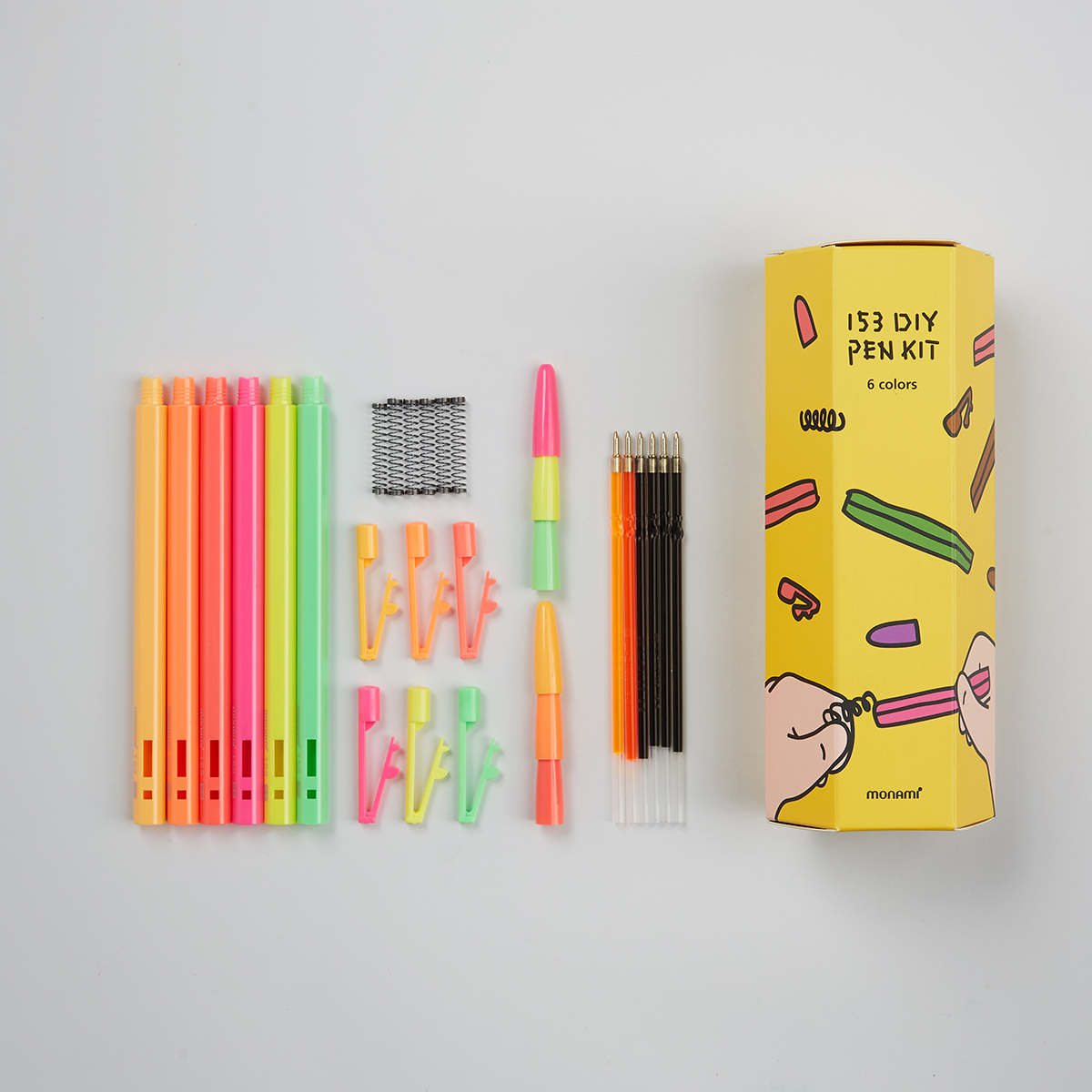
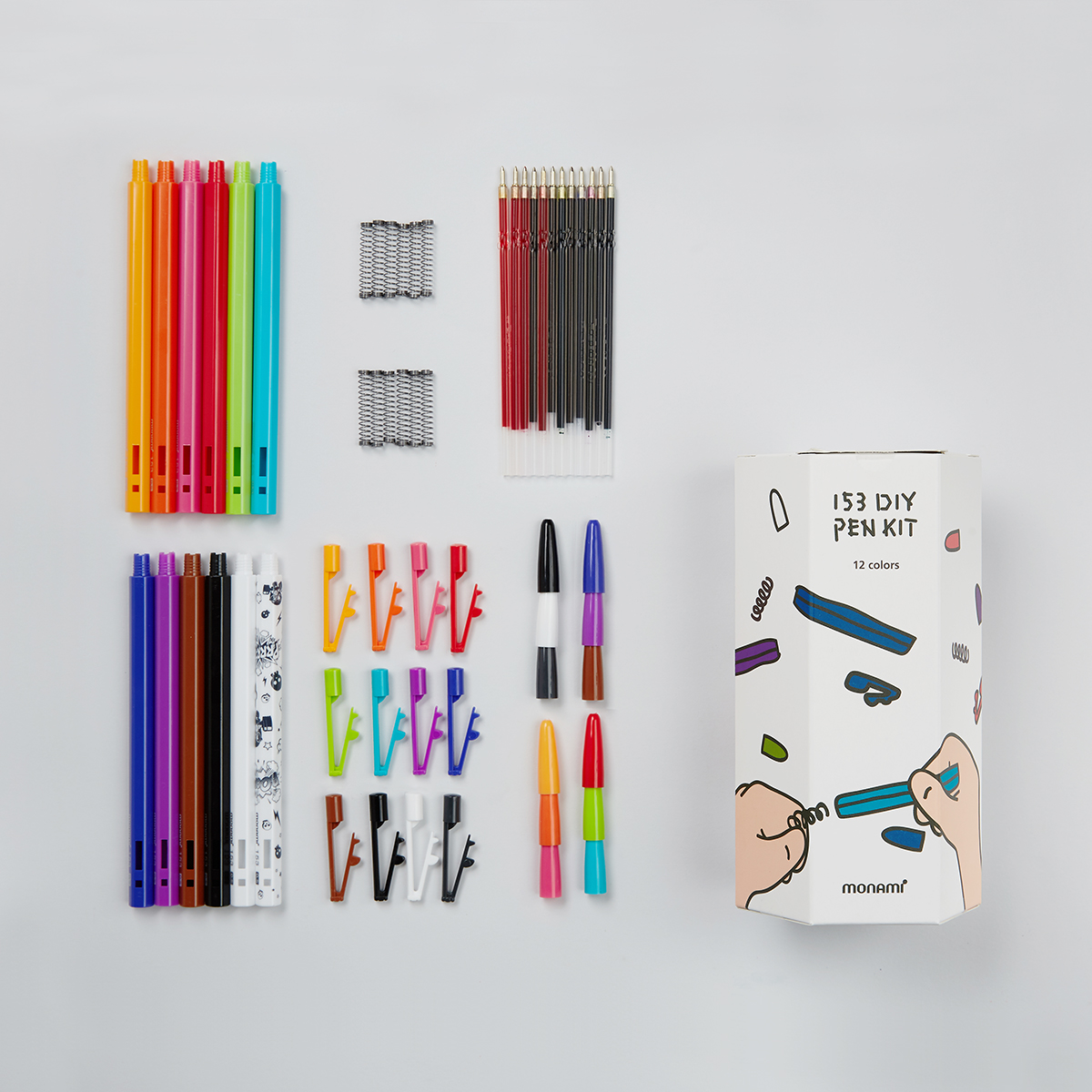
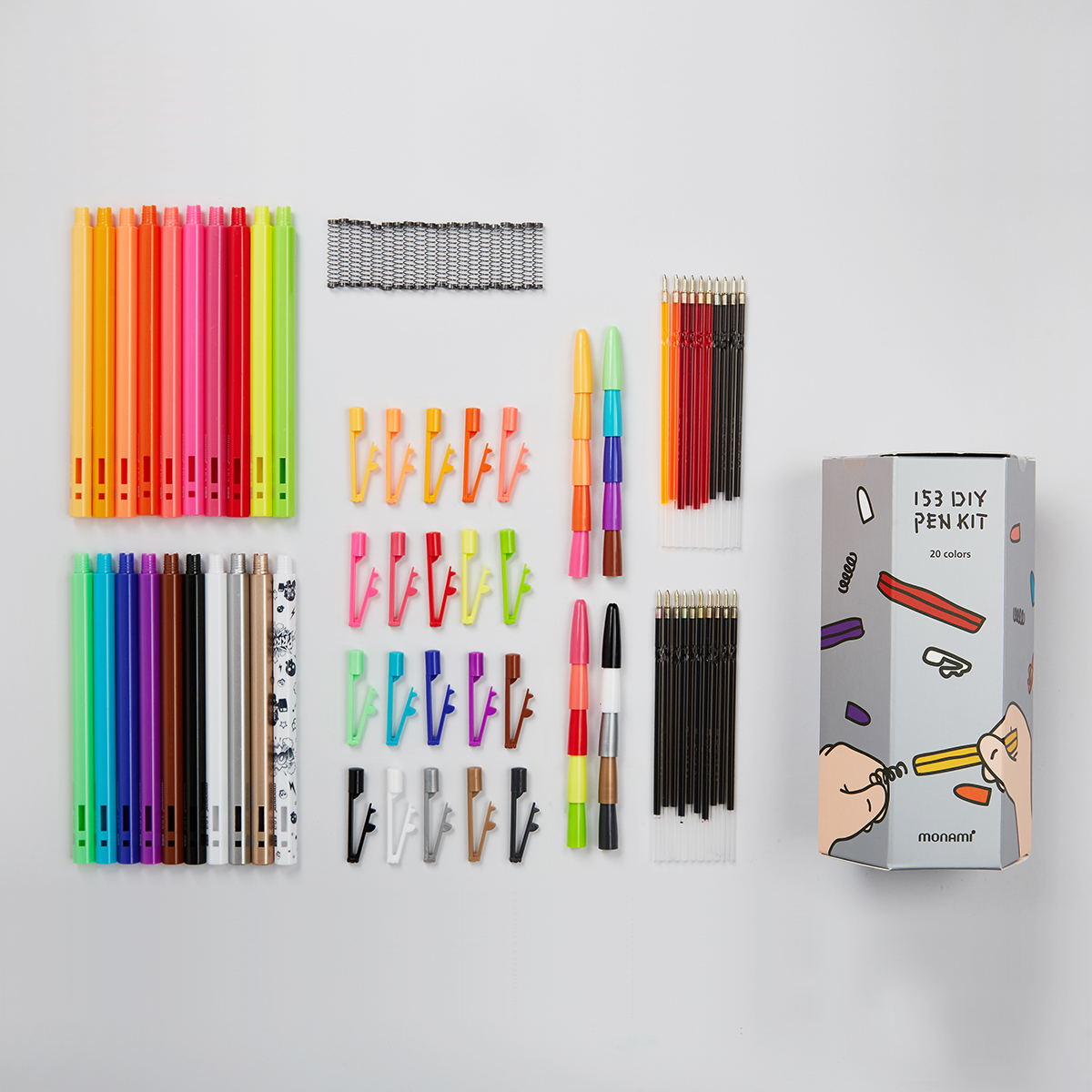
153 DIY 펜 키트
153 DIY PEN KIT
모나미 펜을 떠올렸을때 가장 먼저 떠오르는 153펜 DIY키트입니다.
구금부터 바디, 잉크색상, 노크 등 모든 부품을 원하대로 색상을 골라 나만의 펜을 만들 수 있는 키트입니다.
6개,12개, 24개입 입니다.
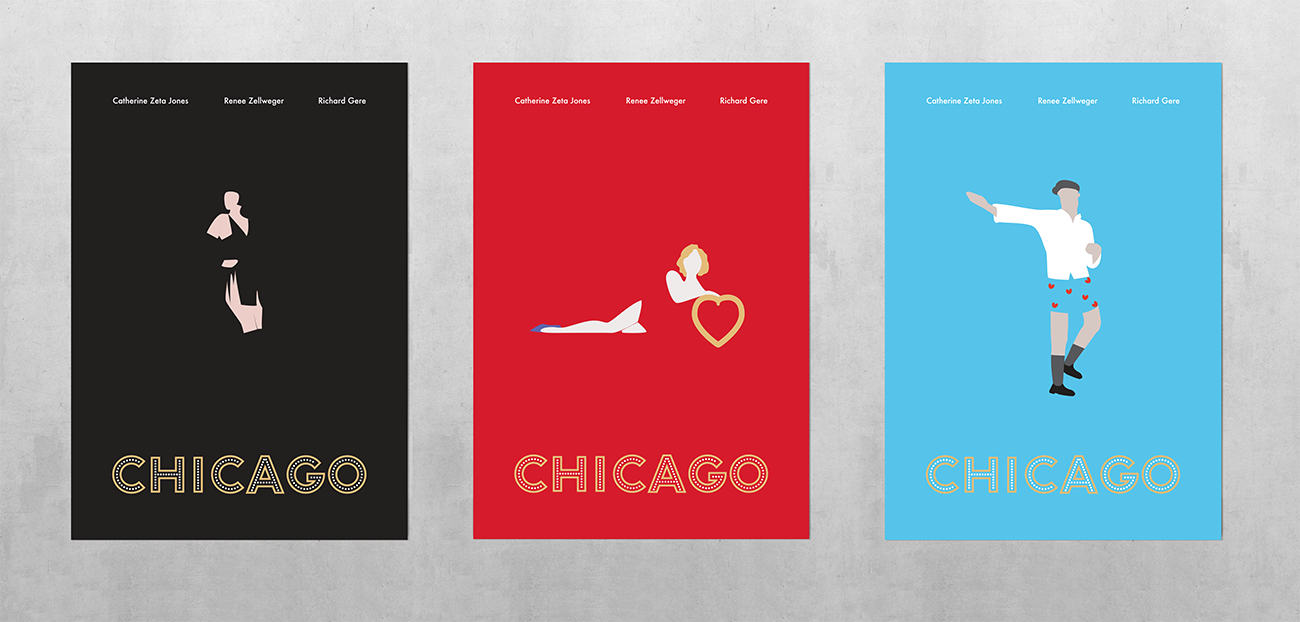
Art Poster
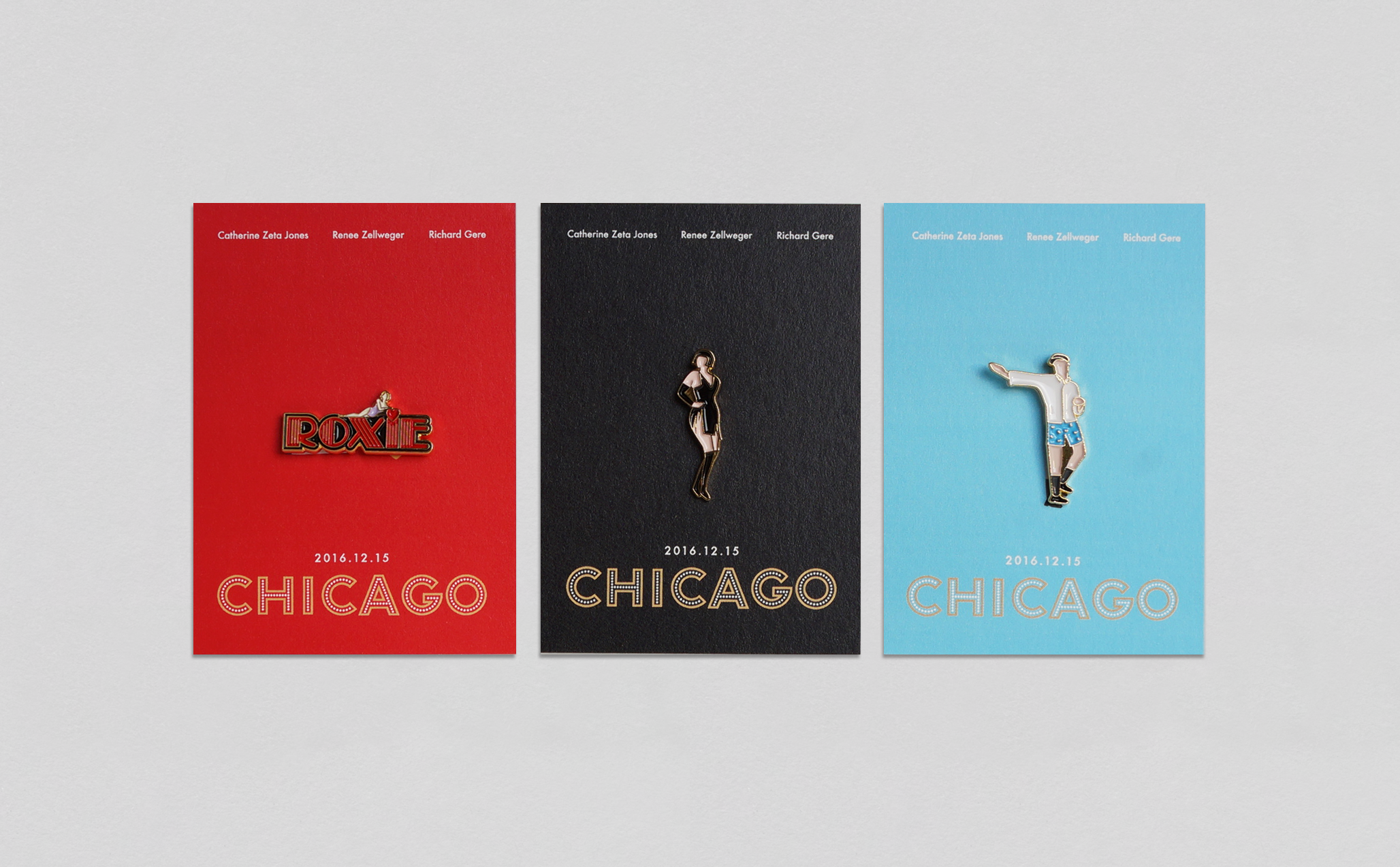
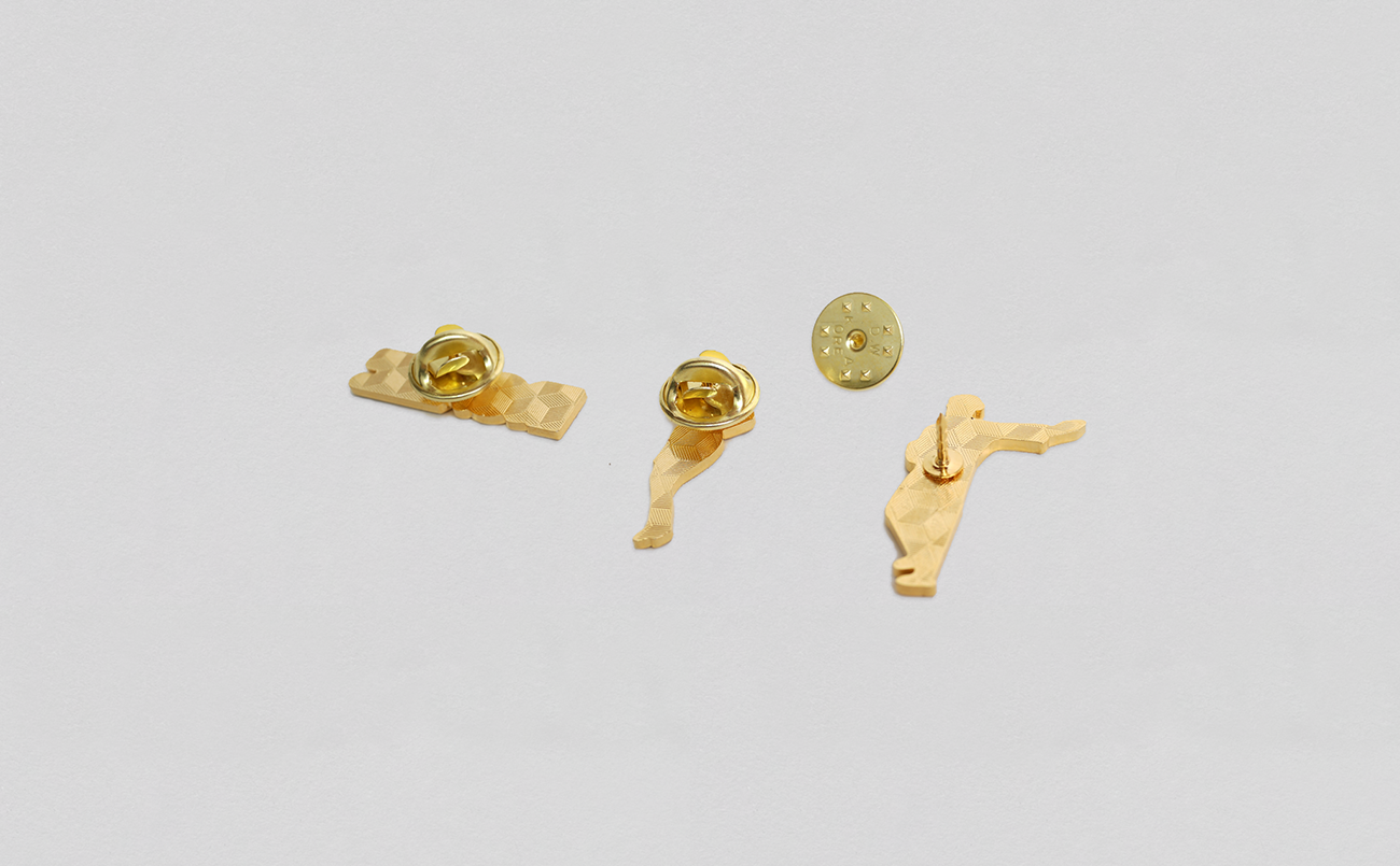
Graphic Badge
Post Card
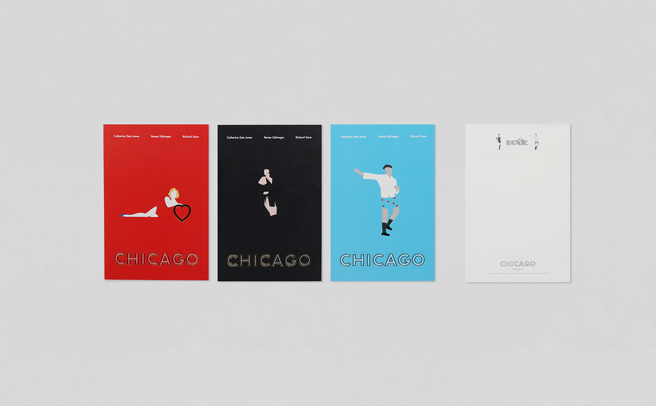
2002년 개봉한 명작 'CHICAGO'의 2016년 재개봉 아트 포스터와 뱃지, 포스트카드를 제작했습니다.
뱃지와 포스트카드는 CHICAGO의 등장인물들의 '벨마,록시,빌리' 캐릭터를 살린 아트 포스터를 바탕으로 제작했습니다.
화려한 무대 위 캐릭터를 간직할 수 있는 금속 뱃지.
캐릭터가 가지고있는 색감과 무대 위 동작이 담긴 포스트카드입니다.
영화 시카고를 기억하는 팬들에게는 주인공마다의 포스트카드와 뱃지를 하나씩 모아 간직할 수 있는 재미와, 영화 시카고를 처음 보는 사람들에게는 화려한 장면 속 주인공들의 캐릭터를 기억할 수 있는 특별한 선물이 되길 바라는 마음을 담았습니다.
'CHICAGO'의 재개봉 날짜는 12월 15일입니다.
Client
- CINEGURU
Design
- maumstudio