CANTAVIL
Brief
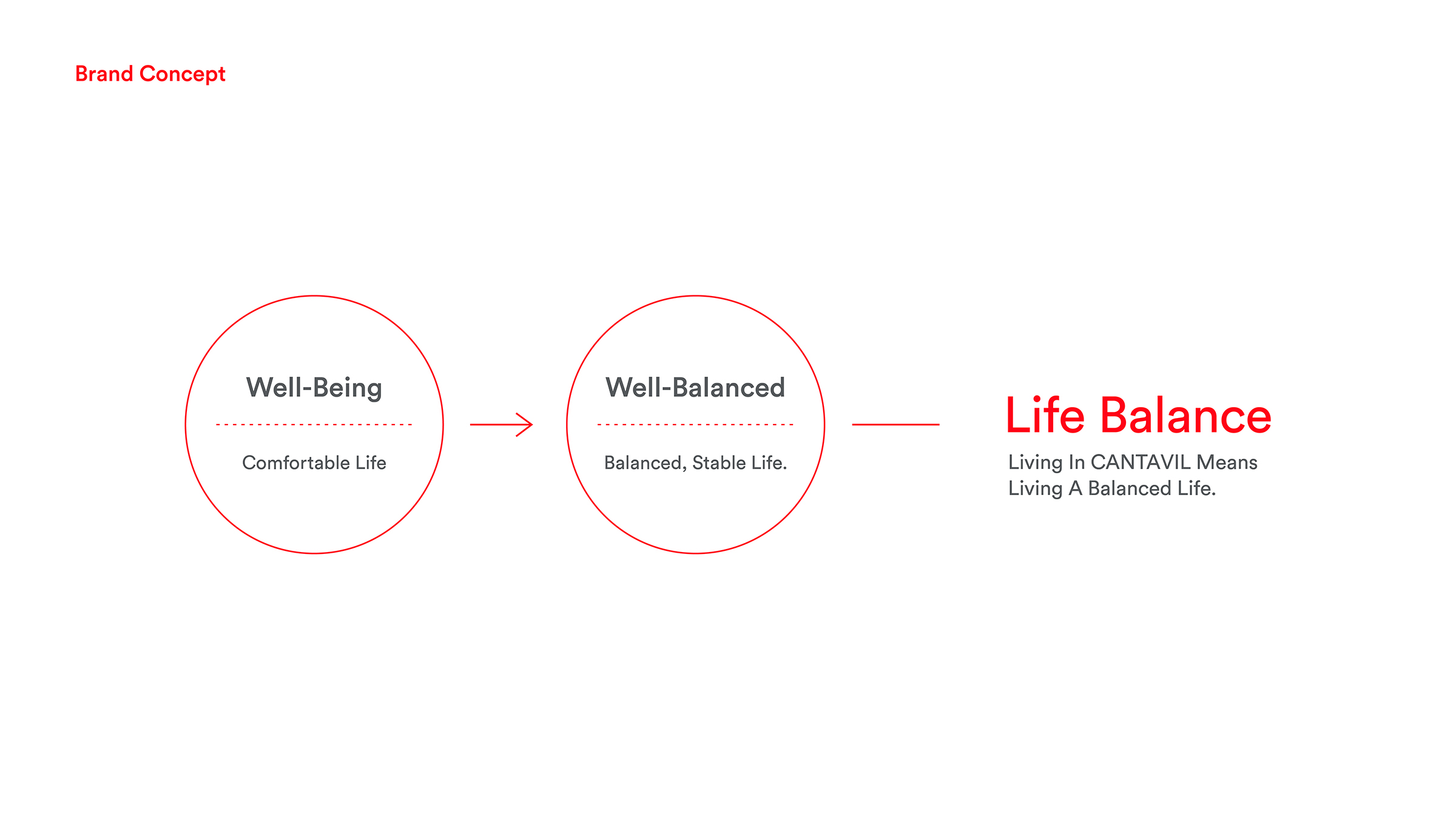
Named after the musical term “cantabile,” meaning “singingly,” CANTAVIL is an apartment brand dedicated to building happy homes that make people sing.
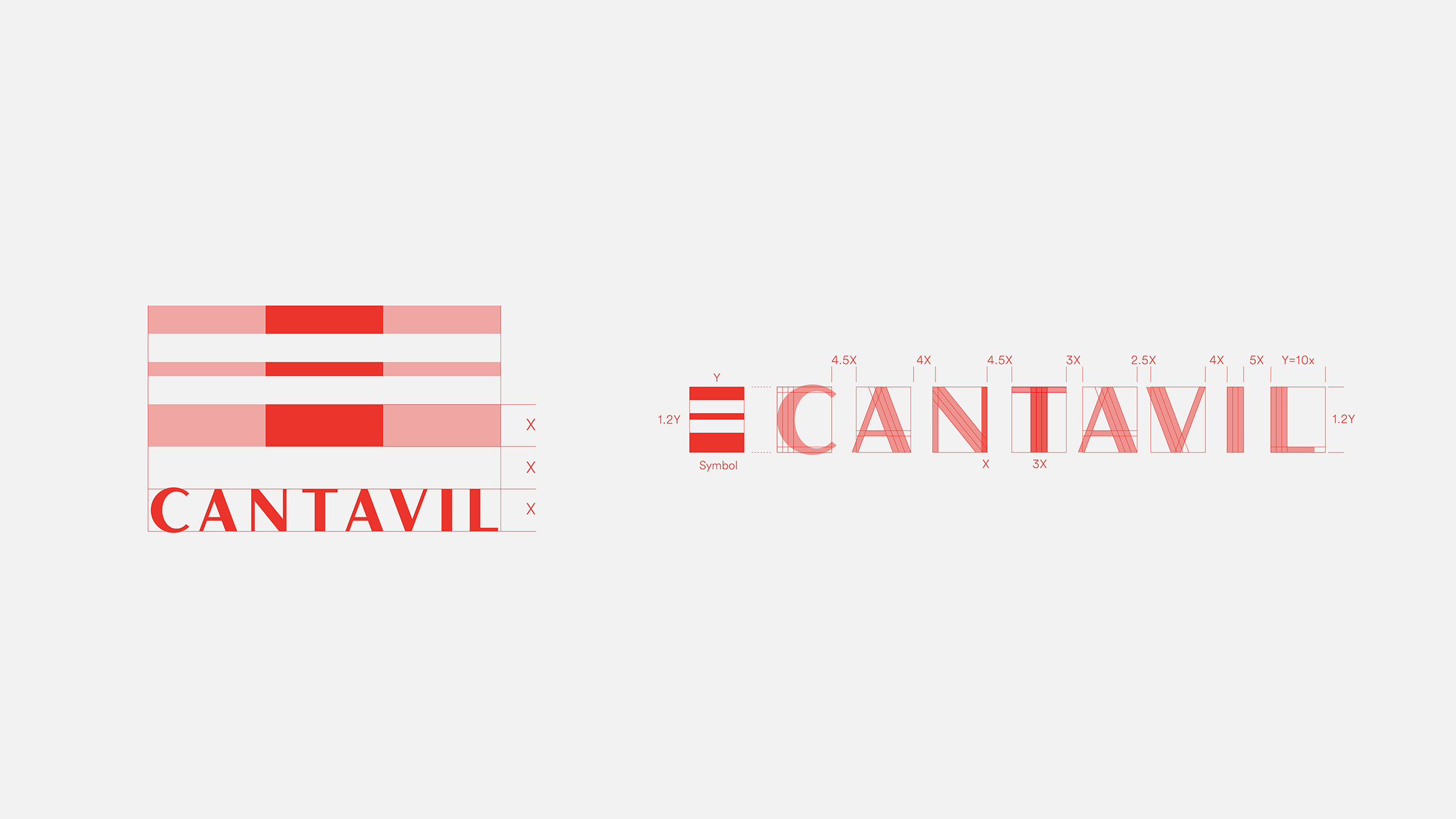
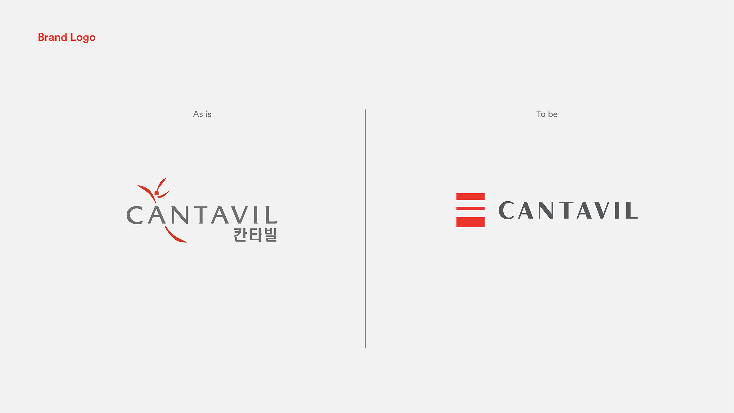
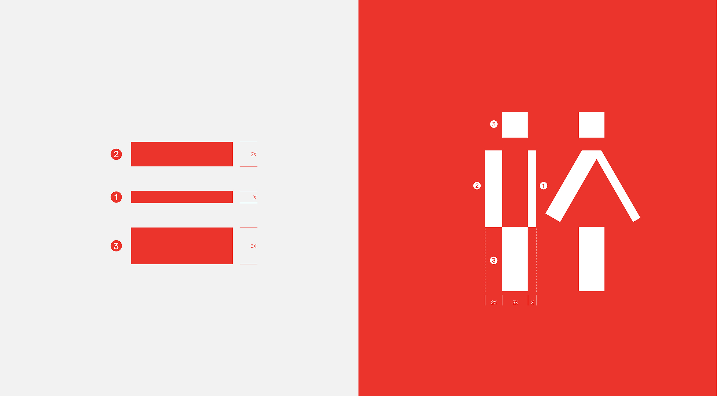
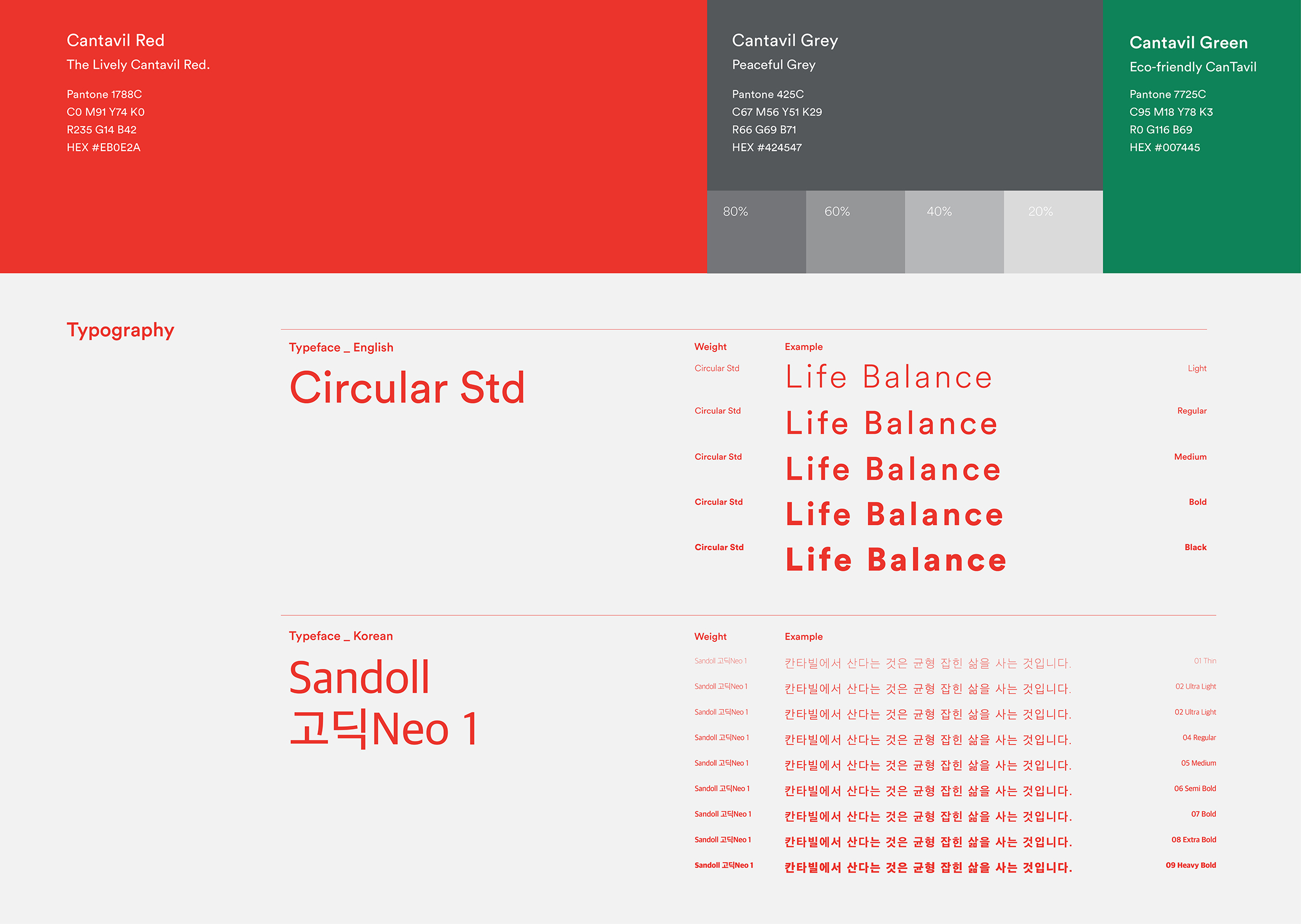
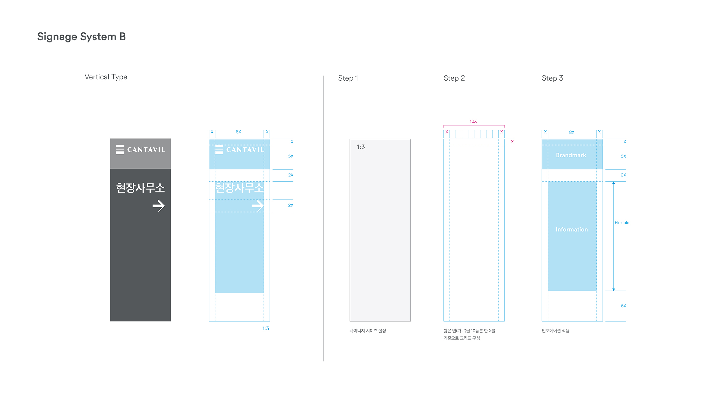
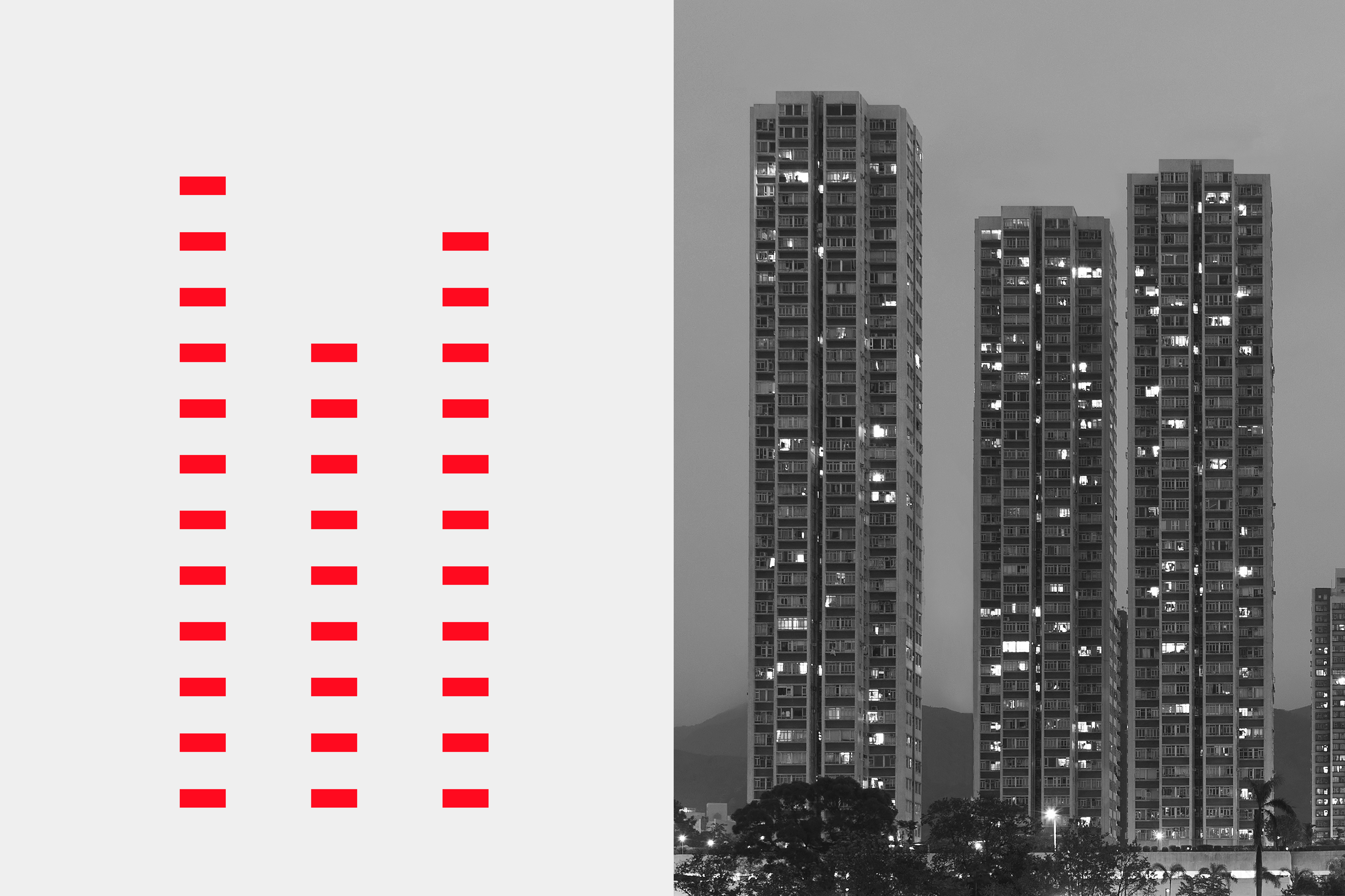
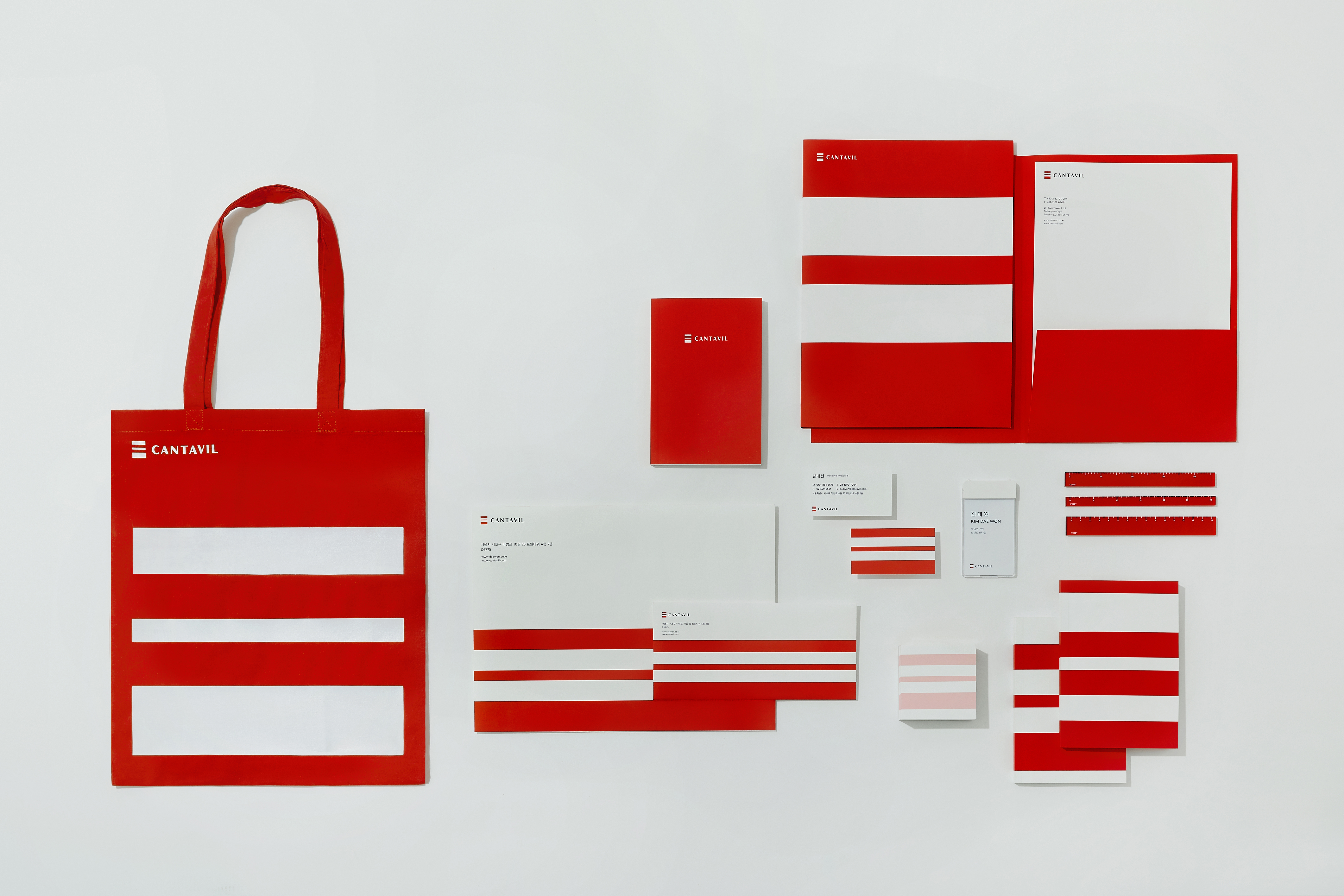
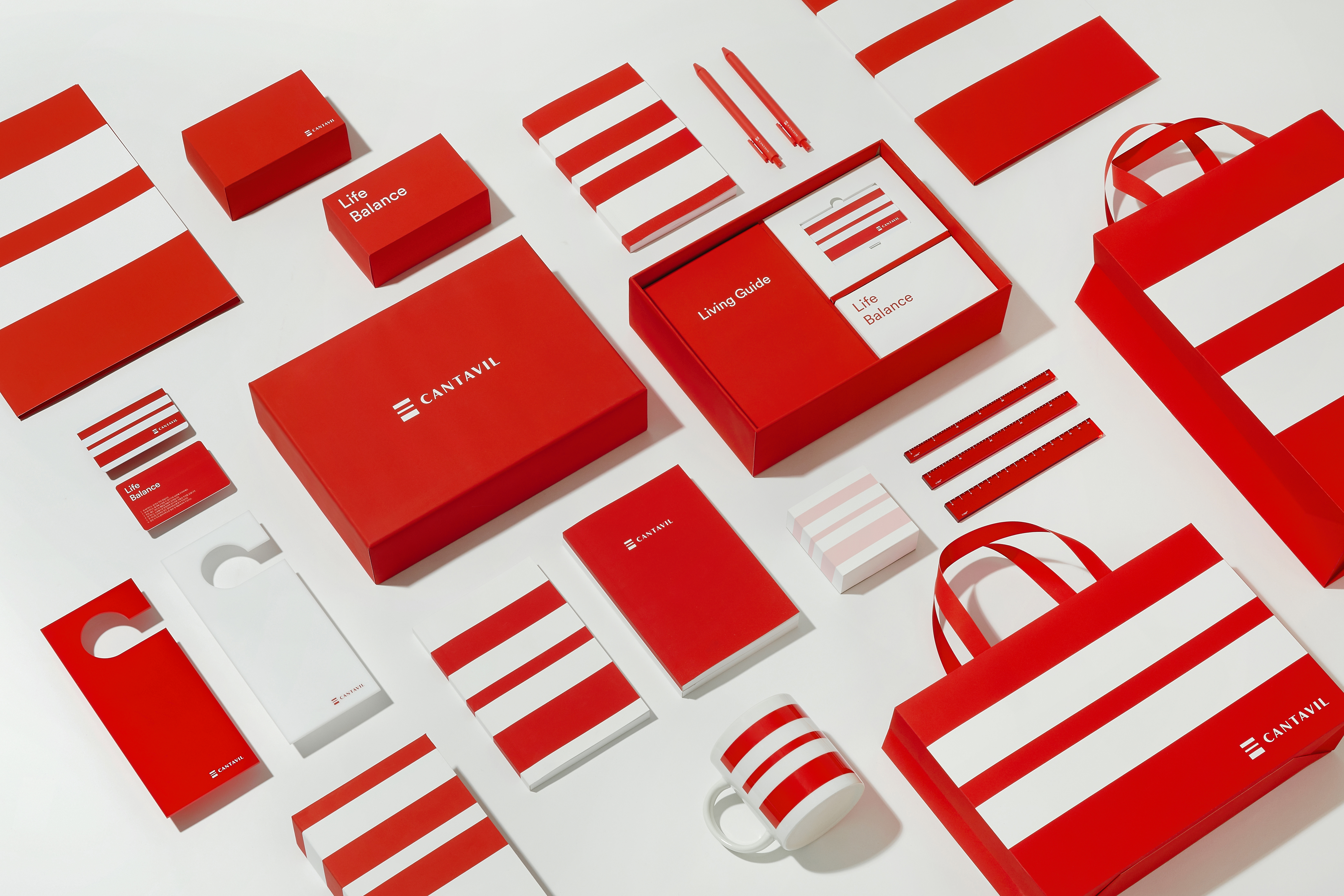
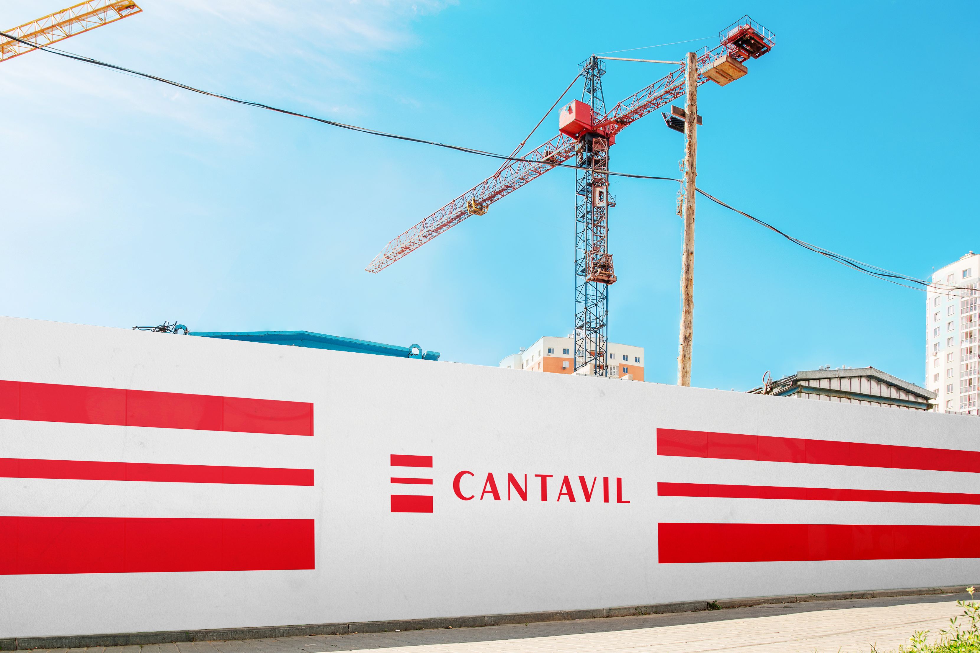
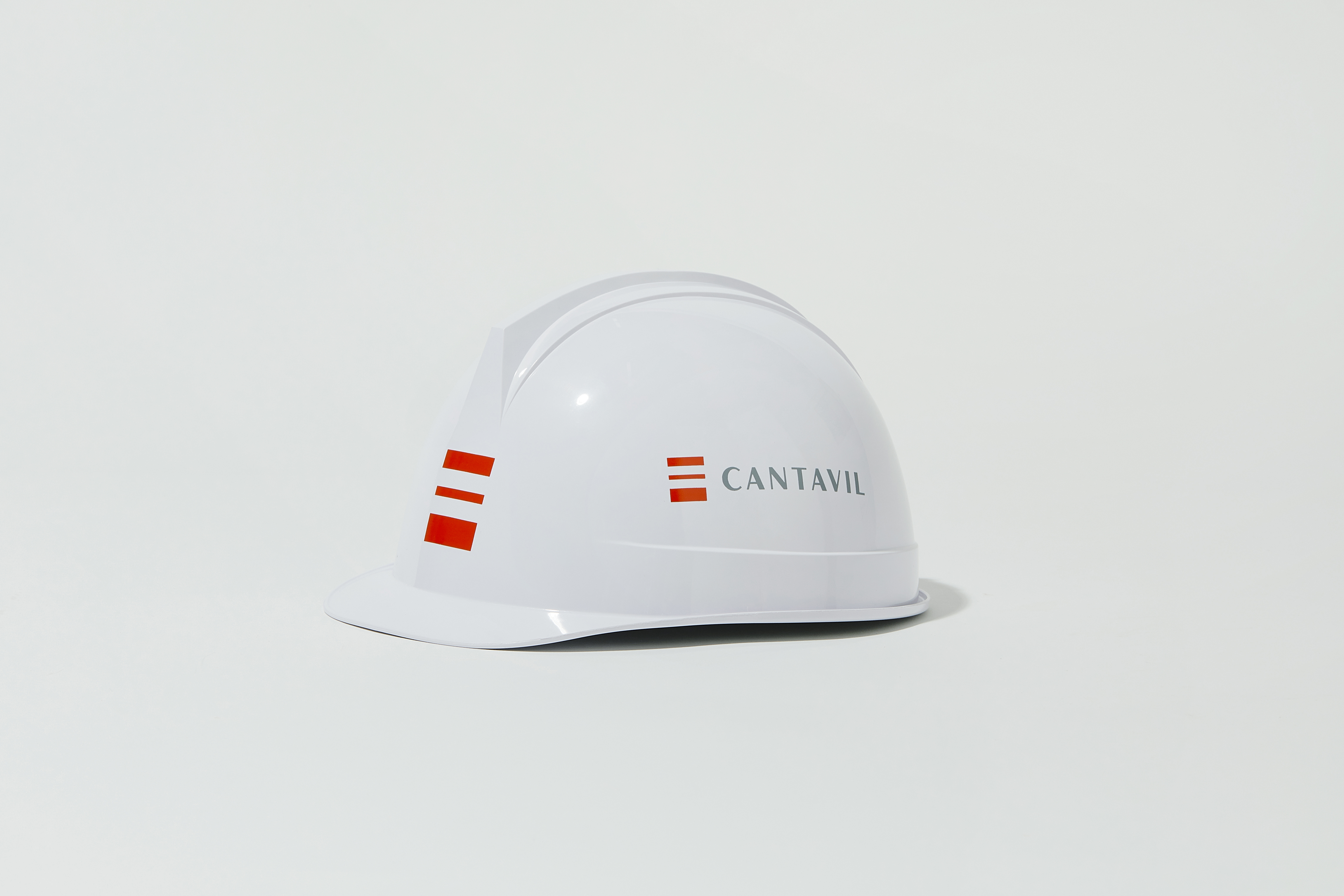
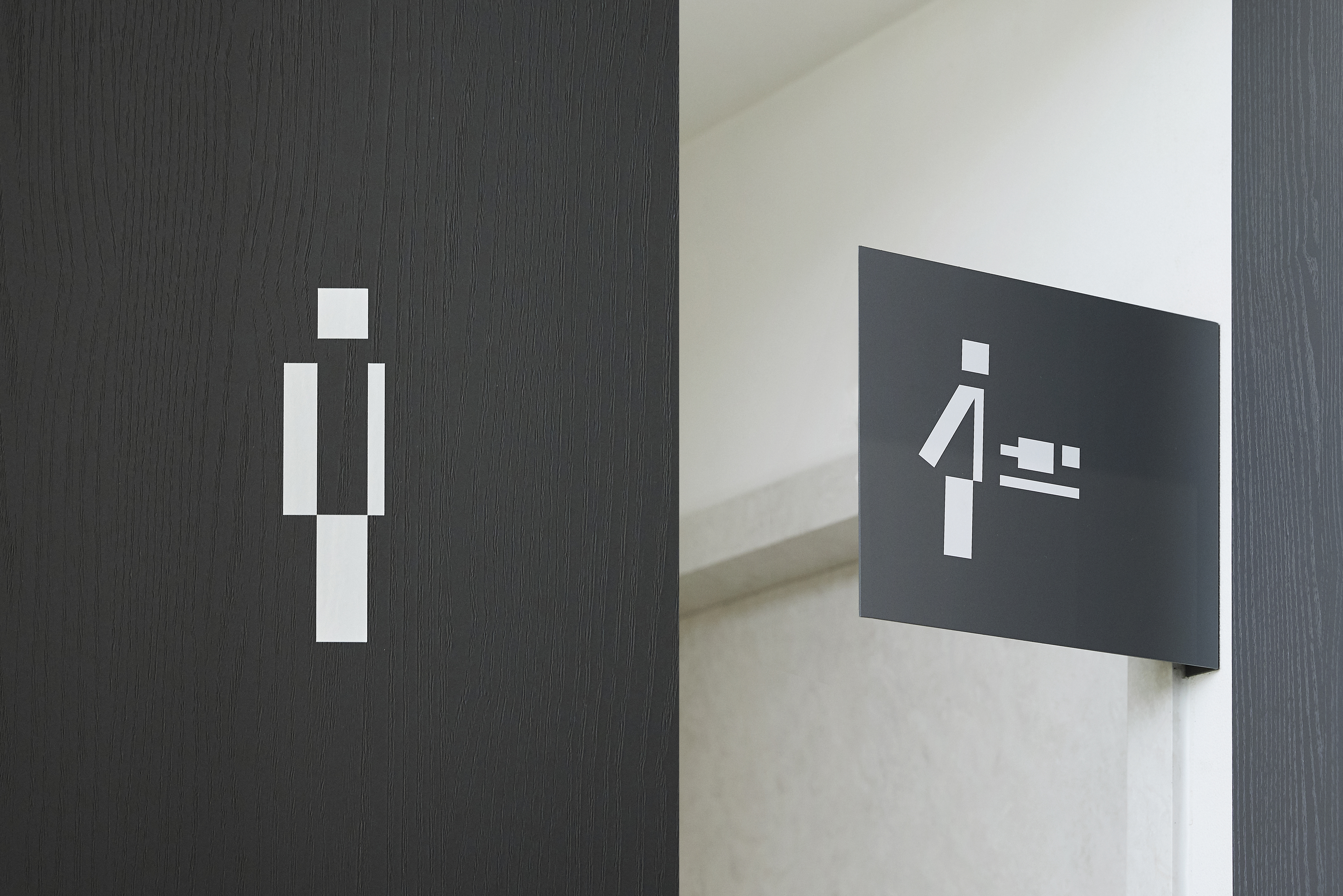
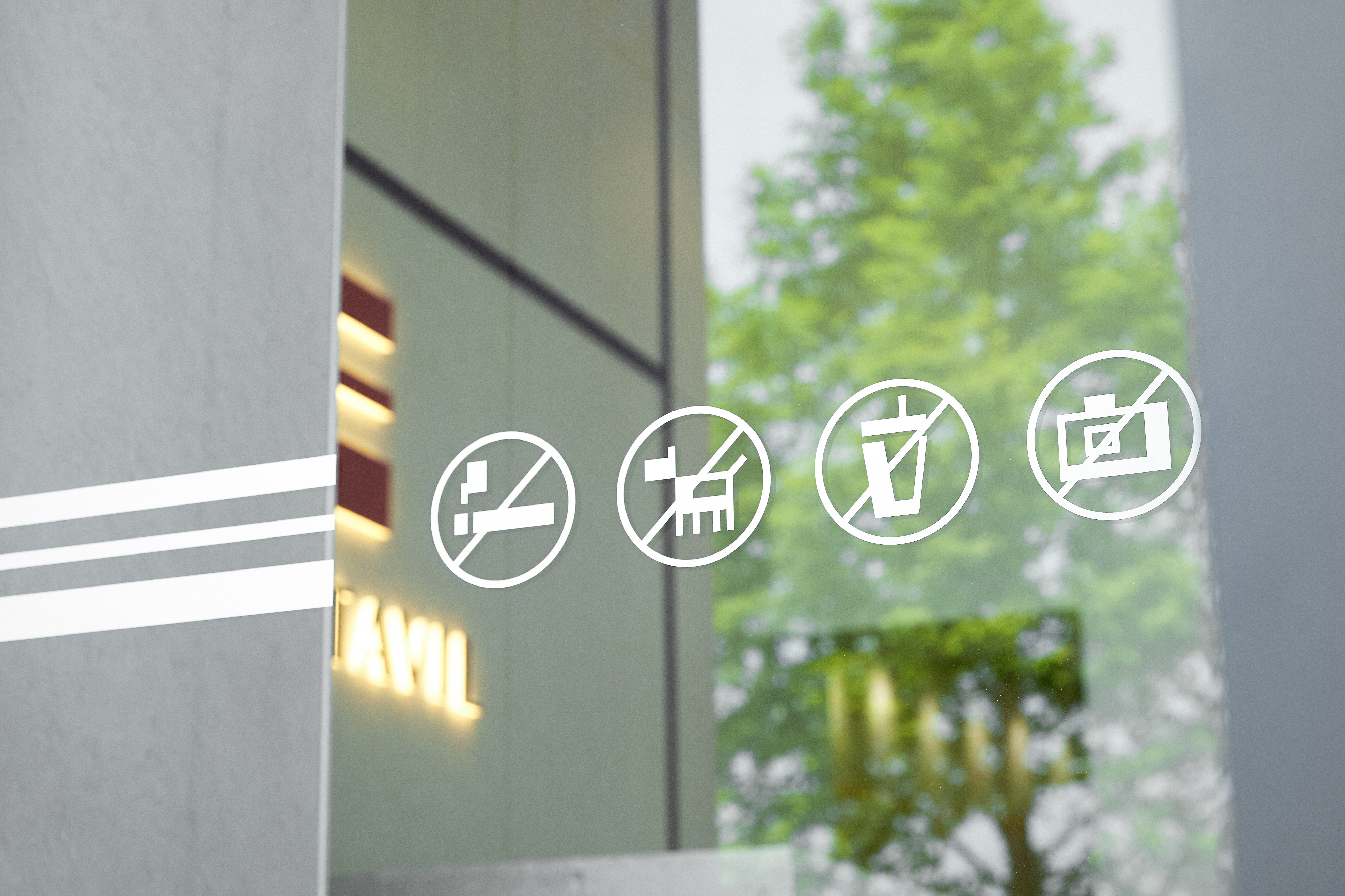
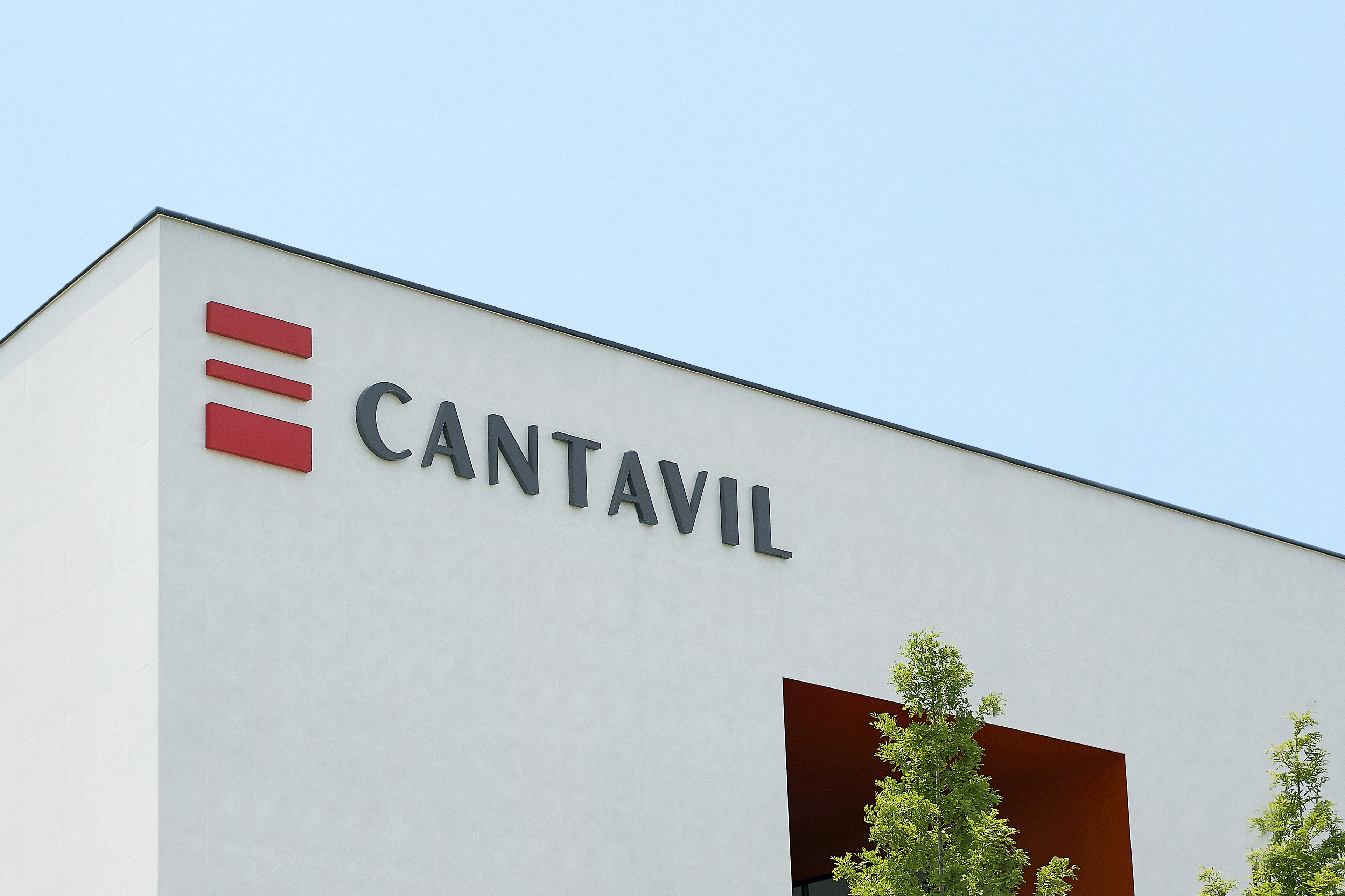
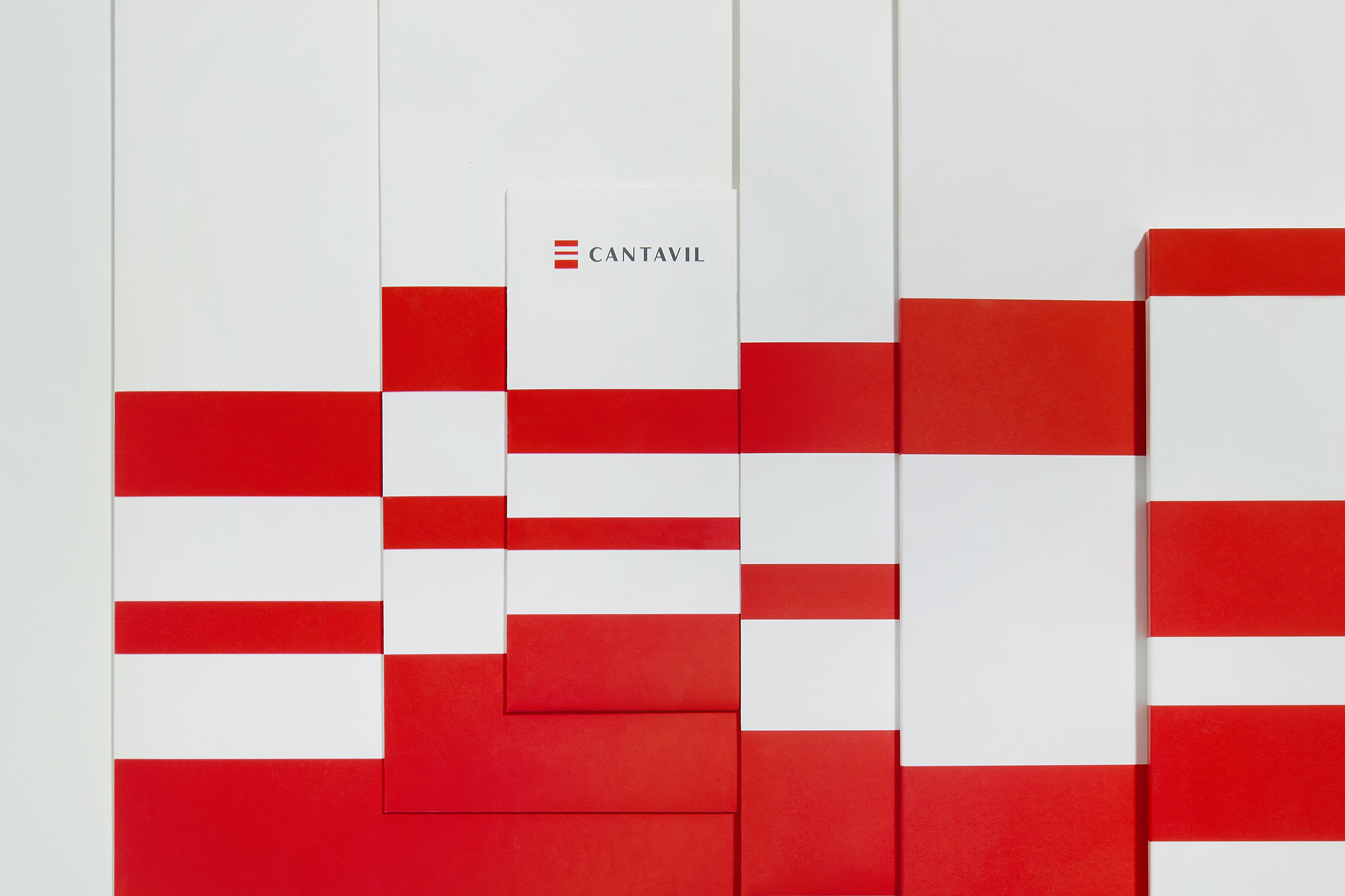
In rebranding its identity as a lifestyle brand that advocates comfortable and well-balanced living spaces, CANTAVIL has redesigned its logo and signages under the concept of “life balance” to visualize the “harmonious balance between the spatial and activity-accommodating qualities of an apartment” as a characteristic symbolic of the brand. The signages are flexibly applied within the organic system of lines and planes, and the main color, “CANTAVIL Red,” is used as a consistent visual element to provide customers with a coherent brand experience.
칸타빌은 ‘노래하듯이’라는 ‘칸타빌레’의 줄임말로 노래가 절로 나오는 행복한 집이라는 의미를 가진 아파트 건설 기업입니다.
편안하고 균형잡힌 삶의 공간을 제안하는 라이프스타일 브랜드로서 칸타빌의 새로운 브랜드 아이덴티티를 선보입니다.
‘라이프 밸런스’를 리브랜딩의 컨셉으로 B.I와 사이니지 작업을 진행하였습니다. 아파트의 공간적, 활동적영역의 조화로운 균형이라는 특성을 칸타빌의 새로운 상징으로 시각화하였습니다.또한 사이니지 시스템은선과 면의 유기적인 시스템 안에서 유연하게 적용됩니다. 메인 색상 Cantavil Red는 고객 접점에서 일관된 브랜딩 경험을 전달하는 시각 요소로 활용됩니다.
Client: DAEWON
Description: Brand Identity Relaunch
Project Lead team: DAEWON(Yongseok Kim, Yeonwoo Choi)
Design Direction: maum studio(Dalwoo Lee), Garam Kim
Graphic Design: maum studio(Yoonji Lee, Hyunjin Lee, Jaewon Chung, Kyungryun Ju)
Space Design: Eunhye Oh, Munho Choi, Youngbak Jeong, Hanwool Kim
Date of completion: 2022. 4
Photo: Juyeon Lee